
Everyone in advertising repeats that less is more. The counter-argument is obvious: if the ad never says what you sell, nobody can want it. Both sides are right, in different places, and the deciding number is measurable.
That number is how long somebody actually looks at your ad. It has been measured with eye trackers on real roads and real screens, and it sets a hard limit on how many words you get.

A driver looks at a billboard for a third of a second
The US Federal Highway Administration put eye trackers in cars and drove 55 people past real billboards in Reading, Pennsylvania and Richmond, Virginia.
- The average look at a digital billboard lasted 0.379 of a second, and at a printed billboard 0.335 of a second. That is a single glance, and it is about as long as the average glance drivers gave the road ahead.
- The longest single look at any billboard in the whole study was 1.335 seconds. Nobody stared. Looks longer than one second were rare events.
- Adding up every glance a driver gave one billboard, the total came to between 0.674 and 1.386 seconds. Drivers took two or three quick flicks rather than one long look, so that total is the real amount of time an ad gets.
- A second field study using eye trackers in traffic found drivers gave advertising just 1.2% of all their glances, lasting 0.5 to 0.75 of a second each. Two independent studies, and both land under one second.

A driver has time to read only three to five words
Turning that time into a word count needs one more number, and it has also been measured properly. A 2019 review of 190 studies covering 18,573 people put adult silent reading at 238 words a minute, which is just under four words a second.
- A single 0.335 second glance at a printed billboard is long enough for one or two words. That is the whole reason a billboard with a paragraph on it fails. The driver never had time to reach the end of the first line.
- The full 0.674 to 1.386 seconds a driver spends on one billboard is long enough to read three to five words. Not a sentence, not a tagline plus a phone number plus a web address. Three to five words.
- A display banner that somebody does look at gets 1.3 seconds on average, which is long enough for about five words. Measured by the eye-tracking firm Lumen Research across its panel.
- Reading is what takes the time, and recognising a familiar logo takes almost none of it. A logo is taken in at a glance rather than read left to right, which is why the brand mark is the one element that always fits.

Very simple billboards only work for brands people know
Three to five words creates an obvious problem. If the brand name takes two of them there is almost nothing left, which tempts advertisers into running the name on its own. That works for exactly one kind of advertiser.
- A logo the reader already knows is taken in at a glance, so it uses up none of the three to five words. The limit above is a reading limit, and a familiar mark is not read left to right, so a well known brand can spend every word it has on the message instead of on its own name.
- An unfamiliar brand name has nothing already in the reader's head to match it against, so it has to be read like any other words. Two words of a name nobody knows really do come out of the three to five, leaving two or three for everything else.
- The very simple billboards you drive past are simple because the brand was already famous before the board went up. Copying that look without the recognition removes the one job the picture was doing for them, which is saying who the ad is from.
- A brand name with no category beside it leaves the reader with no idea what the business does. "Vlix" tells a driver nothing at all, and "Vlix, language apps" tells them what it is in three words, which is the smallest billboard that does any work.

A new brand cannot introduce itself and persuade in five words
Every short billboard line in this article quietly assumes the logo is saying who the ad is from. A brand nobody knows yet does not get that assumption, and it changes what the five words have to do.
- A billboard has three jobs and five words, and a logo people know does the first job without using up any of them. The three jobs are saying who you are, saying what you sell, and giving one reason to care. A familiar mark covers the first, so all five words are free for the other two.
- A line like "200 classes. $14.95." only works because the gym's logo is on the board saying whose classes they are. Most short billboard rewrites, including the ones later in this article, never mention the advertiser at all. They are quietly leaving that job to the picture.
- An unfamiliar name plus its category costs two to three of the five words, which leaves room for one fact at most. "Vlix, language apps" is already three words. Adding "15 minutes a day" takes it to seven, which is well past what a driver can read.
- A new brand has to choose between introducing itself and making an argument, because five words will not carry both. Attempting both produces a board that does neither, and that is the most common way a small advertiser wastes the money.
- Choose being understood, because a driver who cannot tell what you sell has nothing to remember you by. A board reading "Vlix, language apps" has done the one job it had time for. A board reading "15 minutes a day" under a logo nobody recognises has argued for something the reader cannot identify.

The seven word billboard rule rests on a misread study
Almost every billboard guide says seven words or fewer, and almost every one of them credits the same source: George Miller's 1956 paper on the magical number seven. That is not what the paper says.
- George Miller said his own magical number seven had nothing to do with reading. His words: the point was that seven was a limit for telling apart simple signals like pitch and brightness, and a limit for immediate recall, "neither of which has anything to do with a person's capacity to comprehend printed text".
- The real working memory limit is now put at three or four items, not seven. So even the number being borrowed has moved since 1956.
- The seven word advice lands near the right size by luck, and looking time is the real reason. A third of a second at four words a second comes out at three to five words, and that reasoning survives scrutiny where the memory story does not.
- The widely quoted claim that six to eight words gives 65% better recall has no traceable source. It appears on billboard company blogs with no study attached, so it is not evidence.

Every ad medium ranked by how many words fit the time
Same arithmetic applied to each place an ad can run. The number of words is the measured looking time multiplied by four words a second.
| Where the ad appears | Words there is time for | Measured looking time | What fits in that |
|---|---|---|---|
| Headline in a feed or a search result | Up to 18 | The reader decides | The whole story, with one real fact in it |
| Display banner, when it is looked at at all | About 5 | 1.3 seconds | One claim and the brand |
| Printed billboard, every glance added up | 3 to 5 | 0.674 to 1.386 seconds | One idea and the brand |
| Digital billboard, every glance added up | About 4 | About 1 second | One idea and the brand |
| Digital billboard, one glance | 1 to 2 | 0.379 seconds | A logo, or one word |
| Printed billboard, one glance | 1 to 2 | 0.335 seconds | A logo, or one word |
The top row is the odd one out, and it is where the rest of this article goes. When the reader controls how long they look, the time limit disappears and the advice reverses.
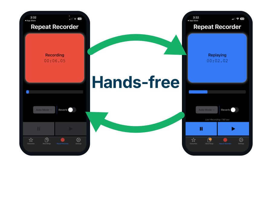
Use Repeat Recorder to time your billboard line out loud
The word limit above is hard to judge while you are staring at a design file, because every line looks short in 200 point type. Saying it out loud puts a real clock on it, and the same 2019 review measured reading aloud at 183 words a minute, so five words takes about 1.6 seconds to say. Repeat Recorder, one of my own apps, is a recorder built around a loop: you speak, it replays what you said, and it records your next attempt.
- Repeat Recorder plays your line back about a second after you say it, so you hear the length rather than guess at it. A line you cannot finish in one breath is also too long for a billboard.
- Repeat Recorder can loop one take as many times as you set, or forever until you stop it. Hearing the same five words over and over is how you find the one word doing no work.
- Repeat Recorder has a fully hands-free mode where speaking starts the recording and stopping replays it. You never touch the screen, so you can run through candidate lines while walking or holding a layout.

Longer ads beat shorter ads whenever the reader can click
To test the less is more claim where clicking is possible, I used a public archive of randomised advertising experiments run by the publisher Upworthy between 2013 and 2015. Each test showed the same article in the same place on the same day and changed only the wording. I kept the 10,592 tests where the picture was identical too, then compared the shortest and longest wording inside each test.
- The shorter wording won only 43.9% of 10,372 randomised tests, and lost 6.4% of the clicks the longer wording got. This is the opposite of less is more, and with 10,372 tests it is not a fluke.
- The bigger the length gap between the two wordings, the worse the shorter one did. Where one wording was at least ten words longer, the shorter one won just 34.9% of the time and lost 18.0% of the clicks.
- Adding one word changed nothing, and adding five words won about 6% more clicks. One extra word measured as exactly nothing, so this is about adding a real amount of information rather than trimming or padding.
- The result held separately in 2013, 2014 and 2015, and held when measured in characters instead of words. Three independent years and a different unit, same direction every time.

Extra words only win when they carry a fact
Length by itself is not what wins, and this is the answer to the whole dilemma. I split the same tests by what the extra words actually added.
- Where the longer wording also added a name, a number, a price or a percentage, it won 57.4% of 7,137 tests and gained 8.1% more clicks. Concrete information is what the reader is paying attention for.
- Where the longer wording added only mood and story words with no new facts, the gain fell to 2.4% and was too small to tell apart from chance. Padding an ad with atmosphere measured as nothing.
- The short ad lost because it said less, not because readers prefer brevity. The short ad was not losing because it was short. It was losing because it had less to say.
- Every word you add has to tell the reader something they did not already know. That is a much more useful rule than a word limit, and it is the one the data actually supports.

Adding words stops helping at about 18 words
More is better, but not without limit. Splitting the same tests by how long the wording already was shows exactly where the gain runs out.
- Under ten words, the longer version gained 16.6% more clicks, the biggest gain measured anywhere in the set. A short ad is where extra words are worth the most.
- Between 13 and 19 words, the gain from going longer had shrunk to about 6.5%. Still real, but less than half what it was at the short end.
- Past 19 words the gain was too small to tell apart from chance. That is where adding more text stops buying anything, so about 18 to 20 words is as far as it is worth going.
- Counting clicks by wording length across every test also peaks at 18 words. The click rate climbed from 0.95% at six words to 1.23% at eighteen, then eased off.

Making every word specific backfires in half of tests
Two Cornell researchers ran the other half of this question on the same archive and published it in Scientific Reports in January 2025. They scored how concrete each wording was, word by word, across 8,977 experiments.
- Where the wording was already vague, making it more concrete raised clicks by 5.5%. Being too vague genuinely costs you, which is the fear the less is more crowd never addresses.
- Where the wording was already concrete, making it more concrete cut clicks by 9.9%. A dry list of specifics reads like a spec sheet and loses to a line that leaves the reader something to find out.
- Half of all real tests, 50.9%, sat on the too-specific side, and only 8.7% were too vague. So in practice the more common mistake is spelling everything out, not being mysterious.
- Adding a few facts to a long line wins, and making every single word a specification loses. The winner is a longer line, mostly ordinary words, holding two or three concrete anchors. The loser is a short line where every word is a specification.

Leaving a question unanswered only works where people can click
That leaves the question this article opened with. Does an ad do better when it poses a question and leaves the answer out, so the reader has to click to get it? The archive answers it directly. Two ten word versions of the same article ran against each other. "Ever Wonder What Happens To Your Body When You Fast?" took 1.22% of the clicks, and "Slow Down. Here's Everything You Need To Know About Fasting." took 0.33%. The first one asks a question and stops there.
- The version that left its question unanswered won 56.3% of 1,667 randomised tests of exactly equal length. The middle result was 8.6% more clicks, and a difference that size would turn up by chance about three times in ten million. It also won when the version holding its answer back was the shorter of the two, so it is the words left out that are doing the work rather than the words added.
- Leaving one question unanswered is not the same as being vague from start to finish, which cost 5.5% of clicks. The winner names the person, the place and the problem, and leaves out only the answer. The loser is hazy about everything, so there is no particular question in the reader's mind to go and settle.
- Naming the specific person or product made no measurable difference to clicks in either direction. Across 671 tests the version that named its subject won 51.6% of the time, which is the same as tossing a coin. Saying plainly what you are advertising costs you nothing, so the worry that naming your product scares readers off is not supported.
- A reader only acts on curiosity when the answer is one tap away, and a driver going past at speed cannot tap anything. Every one of those wins came from somebody who could get the answer immediately, with one thumb, without leaving what they were already doing. A driver cannot do that, so the question gets raised and then simply goes unanswered.
- This archive holds two usable tests at billboard length, so it cannot settle the billboard question at all. Everything above is measured on ads people could click. For three to five words on a roadside board there is no click data in existence, which is why the billboard advice here rests on looking time and recall instead.
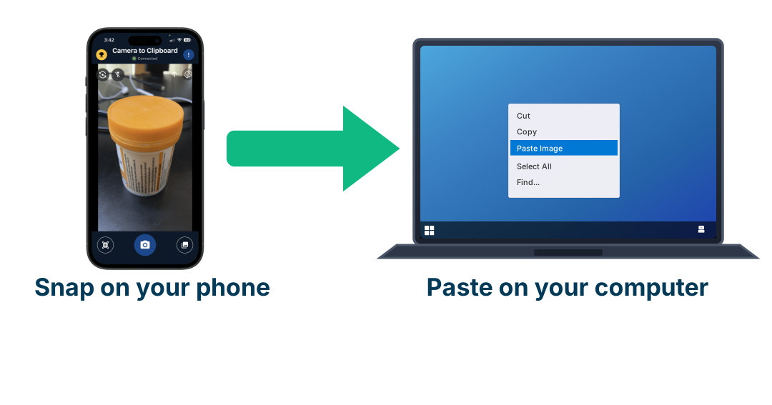
Use Camera to Clipboard to collect billboards you drive past
The best training for this is the billboards you already pass every week, because the ones that work on you are the evidence. The problem is that photos of them stay stranded on your phone. Camera to Clipboard, another of my own apps, puts a photo from your phone straight onto your computer's clipboard, so it is ready to paste the moment you sit down.
- Camera to Clipboard sends the photo to your computer clipboard, so you paste it into a document instead of emailing it to yourself. Building a folder of billboards you actually noticed takes seconds a time rather than a weekly tidy-up.
- Camera to Clipboard pairs your phone to your desktop once and then works over your network. There is no cable and no upload step in the way of a quick capture.
- Pasting the photos side by side is how you count the words in a billboard that worked on you. Most of them will land in the three to five words this article started with, and seeing that yourself is more convincing than being told.

Dense detail hurts attention but elaborate design helps
The most useful study on this separated two things that both get called complexity, and found they pull in opposite directions. It eye-tracked 249 real ads and was published in the Journal of Marketing in 2010.
- Cramming in more detail, more objects and more small elements reduced attention to the brand and made people like the ad less. This is the kind of complexity the less is more advice is really aiming at.
- An elaborate creative idea raised attention to the picture, to the ad as a whole, and to how well people understood it. An ambitious ad is not a cluttered ad, and the study measured them separately to prove it.
- An interesting idea is the one kind of complexity an advertiser actually controls. You cannot buy more looking time, but you can decide whether your idea is interesting.
- Cut the number of things competing on the page, not the ambition of the idea. Fewer separate things competing on the page, with more thought behind the one thing that is left.

Only 35% of display ads are ever actually seen
Before arguing about the words in a banner, it is worth knowing how often anybody looks at one. Lumen Research measures this with eye trackers rather than with delivery reports.
- Only 35% of digital display ads got any looking at all. The other 65% were served, counted and paid for without a human eye reaching them.
- Of the ads that were served, just 9% got more than one second and 4% got more than two seconds. So the five words a banner gets is the good case, not the average case.
- Only about 30% of ads that counted as viewable were actually seen. Viewable is a technical definition about pixels on screen, and it is not the same as looked at.
- Readers avoid banners on purpose, and this was proved with eye tracking back in 2003. People fixated fewer banners than their size and position predicted, meaning they spot an ad in peripheral vision and steer their eyes around it. Only 46.9% could remember seeing any banner at all afterwards.

Billboards now beat display ads for attention
The natural assumption is that billboards stopped working once everybody started staring at their phone. The attention measurements say the reverse, with one caveat worth stating plainly.
- Roughly 2.5 seconds of attention is the point where an ad starts entering memory, and 85% of digital ads fall short of it. That threshold comes from Karen Nelson-Field's attention research.
- About 89% of roadside ads clear that same 2.5 second threshold, against 15% of digital ads. A billboard is a small amount of attention that you reliably get, and a banner is a large amount you usually do not.
- A distinctive brand asset can do the job in 1.5 seconds, which is less time than a billboard already gets. That is a colour, a shape or a character the audience already links to you, working without the name being spelled out.
- The strongest numbers favouring billboards come from companies that sell billboards, so treat the size of the gap as unsettled. A five-year Kantar study reporting 13.3% higher ad awareness for roadside advertising was commissioned by Clear Channel Outdoor, which owns billboards. The direction is echoed by independent eye tracking, the exact multiples are not.
Display ads look cheaper until you count only the ones seen
That comparison is about attention, not money. On money the ranking starts the other way round, because a display impression sells for less than a billboard impression. It does not stay that way.
| Where the ad runs | Cost per 1,000 impressions | Share holding 2.5 seconds | Cost per 1,000 that held attention |
|---|---|---|---|
| Static roadside billboard | $5.21 average | 89% | $5.85 |
| Display banner, open exchange | $3.12 average | 15% | $20.80 |
| Display banner, private marketplace | $8.20 average | 15% | $54.67 |
| Premium or programmatic billboard | $15 to $25 | 89% | $22.47 |
- A billboard costs about half a cent per person reached and a display banner about a third of a cent. These rates are all quoted per thousand impressions rather than per person, so a $5.21 rate is 0.52 cents a head and a $3.12 rate is 0.31 cents.
- Counting only the impressions that held someone for 2.5 seconds, a static billboard comes out about 3.6 times cheaper than an open exchange banner. The banner starts 40% cheaper and ends up far dearer, at $20.80 against $5.85, because 85% of digital ads never hold anyone that long while 89% of roadside ads do.
- A billboard impression and a display impression are not the same unit, which is the biggest weakness in this comparison. A billboard impression is estimated from traffic passing the site, while a display impression is an ad a server sent. Every rate here also comes from companies that sell one of the two media, so treat the direction as real and the exact multiples as rough.

There is no solid proof that billboards change what people do
Everything so far measures attention and memory. Whether a billboard changes what people actually go on to do has been tested properly only once, by Donald Green and colleagues during an American election, and the result is uncomfortable for the medium.
- 298 billboards were randomly assigned across 155 areas, and every result the authors had committed to in advance was too small to tell apart from no effect. The outcome came from public records for 18.4 million people rather than from asking anyone what they remembered, and the wording on the boards was as short and clear as this article recommends, so a cluttered design cannot explain the flat result.
- What was counted was whether a person turned up to vote at all, not who they voted for or whether they bought anything. That is the honest limit on the study. Turning up in a presidential year was already about as common as it ever gets, so it was a hard thing to shift.
- Smaller studies have measured billboards moving sales, so what is missing is the strong proof rather than the effect itself. Bhargava and Donthu recorded an immediate sales response to outdoor advertising in 1999. The industry's own favourite figure, that 44% of people look up an advertiser after seeing an outdoor ad, is a survey run by the companies that sell the medium.
None of this makes a billboard useless. It rules out a large quick change in behaviour, not a small one, and an effect too small to find in an election can still be worth buying when a board costs very little per person who sees it. Billboards are proven to get looked at, so treat one as a way to make a name familiar rather than a way to make somebody act this week.
Use Repeat Recorder to rehearse an ad line while driving
Since this article is largely about what you see through a windscreen, the drive itself is usable time. Repeat Recorder, one of my own apps mentioned earlier, has an automatic mode where speaking starts the recording and going quiet replays it, so you never touch the phone.
- Repeat Recorder's automatic mode needs no taps at all, which is what makes it usable with your hands on the wheel. You say a candidate line, it plays back, you say the next one.
- Repeat Recorder saves the takes worth keeping into folders you name yourself. Ten spoken versions of one line, kept together, is a better shortlist than ten typed ones.

Ten ads rewritten to fit the time they actually get
The fix goes in both directions. Roadside and banner ads come down to the number of words there is time for, while ads the reader can click go up.
| Where the ad runs | Words there is time for | The version with everything in it | The version that fits |
|---|---|---|---|
| Billboard for a gym | 3 to 5 | Join Perth's biggest 24 hour gym with over 200 classes every week from just $14.95 | 200 classes. $14.95. |
| Billboard for an injury lawyer | 3 to 5 | Injured at work? Our experienced team has recovered millions for WA workers, free first consultation | Hurt at work. We win. |
| Billboard for a dentist | 3 to 5 | Family and cosmetic dentistry, open Saturdays, all health funds welcome, book online today | Dentist. Open Saturdays. |
| Billboard for a car dealer | 3 to 5 | Over 400 used cars in stock with 7 year warranty and finance available on approved purchases | 400 cars. 7 year warranty. |
| Digital billboard for a food brand | 3 to 5 | Our new range of hot sauces is made in small batches from locally grown chillies | Hot sauce. Grown here. |
| Display banner for accounting software | About 5 | The complete cloud accounting platform trusted by thousands of Australian small businesses since 2011 | Lodge your BAS in 10 minutes |
| Display banner for a language app | About 5 | Learn a new language with our proven method used by millions of learners worldwide | Japanese in 15 minutes a day |
| Feed ad for a budgeting app | Up to 18 | Take control of your money today | I found $312 a month I did not know I was spending, in about 20 minutes |
| Feed ad for a photo app | Up to 18 | Photo transfers made simple | I stopped emailing photos to myself, and my phone camera now pastes straight into my laptop |
| Feed ad for a roofing business | Up to 18 | Quality roof repairs you can trust | This Perth roof leaked for 3 winters, and the actual problem cost $180 to fix |
The three feed rows go the other way, up from four to six words to about sixteen, and every word added carries a number or a name.

Conclusion: how much text an ad should have
Less is more is not a rule about advertising. It is a rule about time, and it only applies where the time is short and fixed.
- Count the looking time, then allow four words a second. That is the whole method.
- A billboard gets three to five words, and a display banner about five. One glance at a billboard is 0.335 of a second.
- An ad the reader can click should run to about 18 words. Shorter lost 6.4% of the clicks.
- Add words only when they carry a name, a number or a price. Facts gained 8.1%, mood gained nothing.
- Name the person and the problem, then leave the answer out. Spelling it all out lost 9.9%, being hazy lost 5.5%.
- A very simple billboard only works if people already know the brand. A known logo introduces you without using up a word.
- If nobody knows your brand yet, spend the billboard on being understood rather than on persuading. Five words cannot do both.
- Do not expect a billboard to make people look you up. Curiosity needs something to tap.
- Ignore the seven word rule and the memory study behind it. Miller said it had nothing to do with reading.