
Everybody treats a YouTube thumbnail as the thing that wins you the click. Researchers put 24 people in front of an eye tracker and watched them choose from eight real YouTube results.
The thumbnail drove 26 of their decisions. Only 5 were somebody choosing to watch. The other 21 were somebody choosing to skip.

Build your thumbnail around one subject, a few large words, and a promise the video keeps
The whole answer, before the evidence behind it.
- Build it around one subject and at most a few large words, because a single look lasts about a fifth of a second.
- Make it different from the thumbnails around it rather than louder than them.
- Promise only what the video delivers, because YouTube grades the thumbnail on what happens after the click.
- One clear subject first, different from your neighbours second, and never promise more than the video actually shows.
| What the video is about | The words on the thumbnail | How many words | What it promises |
|---|---|---|---|
| Camera review | AWFUL CAMERA | 2, readable at a glance | A negative review, and the video has to be one |
| Repair guide | THIS SNAPPED | 2, readable at a glance | Something broke and you fix it on camera |
| Price comparison | $400 VS $40 | 3, readable at a glance | A straight comparison of two prices |
| Recipe that failed | I BURNT IT | 3, readable at a glance | It went wrong and you show it going wrong |
| Long-running project | 6 MONTHS LATER | 3, readable at a glance | A before and after, with the after shown |
| Investing opinion | EVERYONE IS WRONG | 3, readable at a glance | An argument against the common view |
| Beginner tutorial | YOU ARE DOING IT WRONG | 5, near the limit | A correction to something you already do |
| Gaming build | HOW I BUILT MY GAMING PC FOR UNDER $800 | 9, unreadable at 168 pixels | Too much to take in during one look |

Spend four times longer on your thumbnail than on your title, because that is the attention split
The best measurement of where a viewer's attention goes used a real YouTube layout.
| Part of the video card | Share of all the glances | How long one glance lasted |
|---|---|---|
| The thumbnail | 45.6% nearly half of everything | About a fifth of a second |
| The title | 11.6% | About a fifth of a second |
| The channel name | 7.1% | About a fifth of a second |
| View count | 3.1% | About a fifth of a second |
| The video length | 1.1% | About a fifth of a second |
- The thumbnail took 45.6% of all the glances people gave a video card and the title took 11.6%, a gap of roughly four to one.
- The thumbnail does not hold the eye longer, it simply catches the eye more often.
- An earlier eye-tracking study found the same roughly two to one gap when people were casually browsing rather than searching.
- The honest caveat is that this is 24 people, choosing professionally, from a fixed chart rather than a live scrolling feed.

Design your thumbnail to avoid being skipped rather than to persuade anybody to click
This is the finding almost nobody quotes, and it changes what you put on the picture.
- The thumbnail drove 26 decisions, and 21 of them were people deciding to skip a video rather than watch it.
- When people did choose a video, they mostly could not say what on the card made them choose it.
- Most thumbnail advice is written the other way round, as though the picture had to persuade.
- A thumbnail that makes a claim invites the viewer to judge the claim, and judging is how you get skipped.
- A thumbnail that states a plain fact gives them nothing to reject, which is all you need at this stage.
| What the video is about | Trying to persuade, so it gets skipped | Just stating the thing, so it survives | Why the first one loses |
|---|---|---|---|
| Excel tutorial | THE BEST EXCEL TRICK EVER | PIVOT TABLES IN 3 MINUTES | Makes a claim the viewer cannot check, so it reads as bait |
| Camera review | YOU WON'T BELIEVE THIS CAMERA | THE R6 AFTER A YEAR | Makes a claim the viewer cannot check, so it reads as bait |
| Fitness progress | TRANSFORM YOUR BODY FAST | 6 MONTHS LATER | Makes a claim the viewer cannot check, so it reads as bait |
| Cooking | THE MOST AMAZING PASTA | I BURNT IT | Makes a claim the viewer cannot check, so it reads as bait |
| Coding | LEARN PYTHON THE EASY WAY | WHY MY CODE BROKE | Says nothing specific, so there is nothing to recognise |
| Travel | THE TRIP OF A LIFETIME | 3 DAYS IN TOKYO | Says nothing specific, so there is nothing to recognise |
| Product comparison | THIS CHANGED MY LIFE | $400 VS $40 | Says nothing specific, so there is nothing to recognise |
Make your thumbnail look professional first, because looking amateur is the top reason people skip
The same study recorded what people said out loud as they rejected each video and sorted every argument into a category.
- The two things people said most about a thumbnail were that it made the video look interesting, or that it made the video look boring and unprofessional.
- People judged the look of the thumbnail before they judged whether the video was on the right topic.
- 21 of the 24 people said outright that the thumbnail decided their choice, ahead of every other part of the video card.
- Nobody has published what specifically makes a thumbnail read as unprofessional, so the only honest fix is the measured rules already on this page.
- The honest caveat is that these were 24 trainee physics teachers choosing a video to teach with.
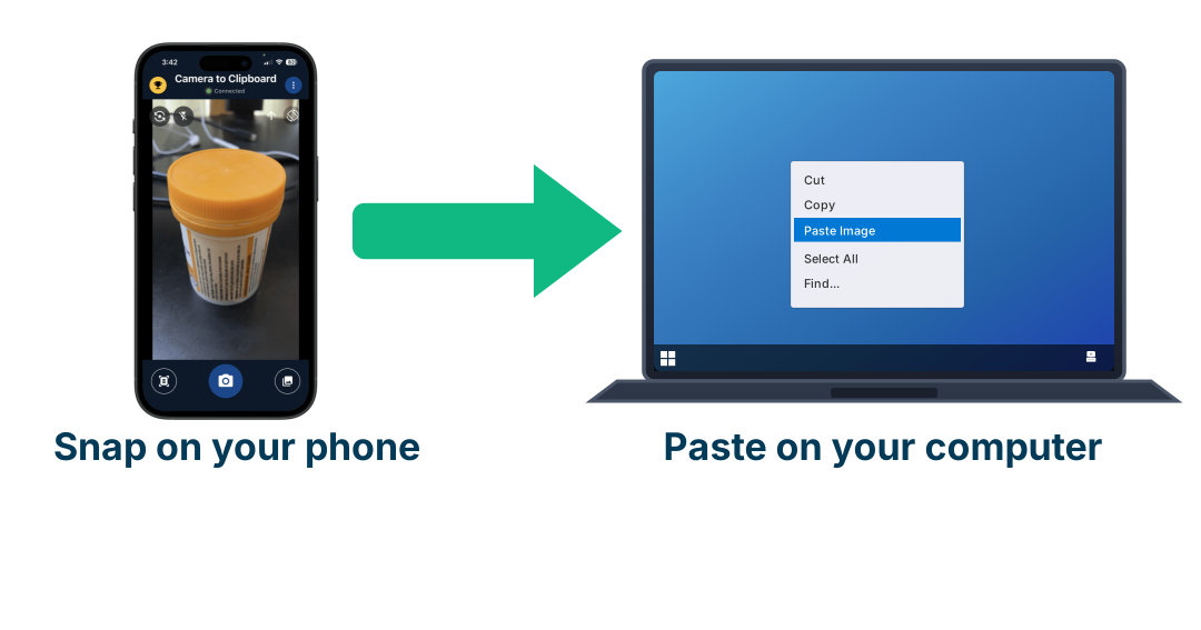
Use Camera to Clipboard to shoot thumbnail photos on your phone
People decide a thumbnail looks amateur before they work out what the video is about, and the cheapest defence against that is a real photograph of a real subject instead of a stock image everybody else is also using. The awkward part is never taking the photo. It is getting the photo off the phone and into the thing you design in. Camera to Clipboard, one of my own apps, turns that into a single step.
- A photo you take inside Camera to Clipboard is ready to paste on your computer the moment you take it.
- Pasting into Photoshop drops the photo in as a new layer, which is where a thumbnail actually gets built.
- You can send several photos at once out of your phone's library, so every take of the same subject arrives together.

Use as few words as possible, because thumbnails with more text get watched less
Text is the single largest gap between what creators are told and what has been measured, and the measurement is not close.
- The largest thumbnail study ever run found that more text went with less watching.
- A separate study of 16,215 YouTube videos found the same split between picture and words.
- Punctuation, capitals and emoji are the one kind of textual decoration with a measured benefit.
- For scale, 38% of thumbnails in that sample carried text at all and 51% carried a human face.

Keep it to about three words, because that is all a glance has time to read
The arithmetic settles this, and it is stricter than the advice you have read anywhere else.
- Adults read about four words a second, and a single glance at a thumbnail lasts about a fifth of a second.
- One glance therefore buys you under one word, and three glances buy you about three.
- Three words is the working answer, and five is the absolute most you should ever put on.
- Judge the result by whether it is legible at 168 pixels wide, not by counting words.
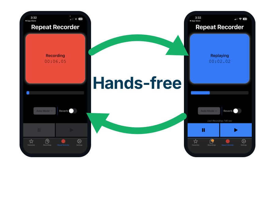
Use Repeat Recorder to rehearse the first line of your video
A thumbnail only has to get somebody to press play, and YouTube then judges the video on whether they stayed. Repeat Recorder, another of my own apps, plays each take straight back without you touching the phone.
- It replays each take and starts recording again on its own, so you can run one line twenty times.
- Hearing it back is what catches an intro that takes forty seconds to deliver what the thumbnail promised.
- Takes worth keeping go into folders you name yourself.

Add a face only when the thumbnails beside yours have none, because faces do not win on their own
"Put a face on it" is the most confident advice in the subject.
- Across more than 300,000 popular videos, thumbnails with and without faces performed about the same.
- Adding an image lifted engagement 119% on Twitter and did nothing at all on Instagram, where every rival post already had one.
- The statistic everyone quotes in favour of faces inverts once every rival thumbnail has one too.
- Faces do reliably grab the eye, which is a different claim from getting the click.
- The exaggerated shocked expression has never been measured.

Be specific only when the thumbnails beside yours are vague, and vague when they are specific
Holding something back is the one piece of thumbnail folklore with a genuinely good study behind it, and the answer is not the one people expect.
- Being more specific raised clicks 5.5% against vague competition and cut them 9.9% against specific competition.
- Only 8.7% of headlines gained from becoming more concrete, while 50.9% lost clicks.
- Whether to hold something back depends entirely on what the thumbnails beside you are doing.
- The honest caveat is that this measured headlines, not thumbnails.
Use negative words instead of positive ones, because each one is worth 2.3% more clicks
Measured across 105,000 headline versions in 22,743 randomised tests.
- Each extra negative word raised the click rate by 2.3%, and each extra positive word lowered it by 1.0%.
- The three commonest negative words in the whole set were "wrong", "bad" and "awful".
- The three commonest positive words were "love", "pretty" and "beautiful".
- Swapping one positive word for one negative one is worth both effects at once, so it moves the most.
| What the video is about | The positive version that loses | The negative version that wins | What the swap is worth |
|---|---|---|---|
| Dividend news | GREAT NEWS | BAD NEWS | Drops a positive word and adds a negative one, so both effects apply |
| Index funds | WHY I LOVE INDEX FUNDS | EVERYONE IS WRONG | Drops the commonest positive word for the commonest negative one |
| Portfolio review | MY BEST FUND | MY WORST FUND | Drops a positive word and adds a negative one, so both effects apply |
| Camera review | A BEAUTIFUL CAMERA | AN AWFUL CAMERA | Drops the commonest positive word for the commonest negative one |
| Beginner tutorial | THE EASY WAY | YOU ARE DOING IT WRONG | Adds a negative word to text that was only neutral |
| Desk setup | MY SETUP TOUR | MY SETUP IS A MESS | Adds a negative word to text that was only neutral |

Do not frighten anybody, because fear lowered clicks by 0.7%
Negative and alarming are not the same thing, and this is where most people take the rule too far.
- Fear lowered clicks by 0.7%, so a frightening thumbnail is worse than a neutral one.
- Anger did nothing measurable at all, so outrage is wasted effort rather than a mistake.
- A negative word passes judgement on something, while a frightening one predicts a disaster.
- Judging is what wins, which is why "the worst fund" beats "the coming collapse".
| What the video is about | The alarming version that loses | The judging version that wins |
|---|---|---|
| Bond market | THE COMING BOND COLLAPSE | THE BOND MISTAKE |
| Market outlook | MARKETS WILL CRASH | MARKETS ARE OVERPRICED |
| Health advice | THIS WILL KILL YOU | THIS IS A BAD HABIT |
| Online security | YOU ARE BEING HACKED | YOUR PASSWORD IS WEAK |

Put one thing in the frame and then stop, because clutter loses to a clear frame
One thing means one subject shot close enough to read at a glance, plus at most a few words. Not a face and an arrow and a circle and a caption.
- An empty frame and a cluttered one both lose to the one in between.
- That came from 22,958 thumbnails backed by two randomised experiments, which makes it the best-evidenced design rule here.
- Across 249 advertisements, dense busyness cut attention to the brand and made people like the advert less.
- YouTube's own guidance says the same thing in plainer words.
| What the video is about | The one thing to put in the frame | The words on it | What tips it into clutter |
|---|---|---|---|
| Camera review | The camera held up close, filling half the frame | AWFUL CAMERA | Adding your face, an arrow and a red circle as well |
| Recipe | The finished dish shot close up | I BURNT IT | Adding the raw ingredients and a logo beside it |
| Price comparison | The two prices side by side | $400 VS $40 | Adding a face, arrows and a border |
| Repair guide | The broken part held in your hand | THIS SNAPPED | Adding the whole tool kit and three captions |
| Before and after | The two states split down the middle | 6 MONTHS | Adding a face, a date and an arrow |
| Reaction video | Your face filling a third of the frame | I WAS WRONG | Adding the clip you reacted to plus a caption |

Skip the arrows, circles and colour rules, because nobody measured them and they add clutter
This is the shortest section in the article because there is genuinely nothing to report, and saying so is more useful than repeating invented percentages.
- Nobody has ever measured what an arrow, a red circle or a border does to clicks.
- What has been measured is that every extra element costs you, so an unmeasured arrow is a measured loss.
- The two most quoted colour studies in the subject cannot be found at all, and the red-thumbnail figures contradict each other at 23%, 30% and 32%.
- The "consistency lifts clicks up to 38%" claim was traced and there is nothing at the end of it.
- What is genuinely measured about colour is only contrast and legibility, worth a few percent at most.

Act on these six thumbnail rules and avoid these five, with the evidence for each
Sortable, so you can order it by whichever column you care about.
- The six to act on are all free and all measured on something.
- The five to avoid either cost you clicks or waste your time for nothing.
| The rule | Do it or avoid it | What was actually found | How strong the evidence is |
|---|---|---|---|
| Make it readable at a glance | Do this first | A glance lasts a fifth of a second | Eye-tracked on a real YouTube layout |
| Be different from the thumbnails beside you | Do | Up 5.5% against vague rivals, down 9.9% against specific ones | 8,977 pre-registered tests |
| Use fewer words, about three | Do | More text went with less watching | 500,000 thumbnails, peer reviewed |
| Put one thing in the frame and stop | Do | Empty and cluttered both lose to the middle | 22,958 thumbnails plus two randomised tests |
| Use negative words, not positive ones | Do | Up 2.3% per negative word, down 1.0% per positive one | 105,000 headline tests, never on thumbnails |
| Add a face only if your neighbours have none | Do | No overall difference, so it only helps where it is rare | 300,000 videos, and it depends on the feed |
| Fear or alarm | Avoid, it costs you | Cut clicks by 0.7% | 105,000 headline tests, never on thumbnails |
| The rule of thirds | Avoid, it failed | Good thumbnails put the subject in the middle instead | Tested once, and it went the other way |
| Arrows, circles and borders | Avoid, adds clutter | Never measured, and clutter is measured to cost you | Nothing exists in either direction |
| Chasing a particular colour | Avoid, wastes time | Claims contradict each other at 23%, 30% and 32% | The two studies cited do not exist |
| The exaggerated shocked face | Avoid, wastes time | Only 1 in 20 thumbnails on videos that took off used one | No measurement found |
- Six rules are worth acting on and every one of them is free.
- YouTube officially recommends the rule of thirds and the only study that tested it found the opposite.
- Read that study carefully before quoting it, because it never measured clicks.

Test your thumbnail against dark mode yourself, because half your viewers see it on near-black
Here is a hole big enough to drive a lorry through, and it is the one thing on this page you could genuinely settle yourself.
- Roughly half your viewers see your thumbnail against near-black rather than white, and nobody has ever tested that.
- Every dark mode statistic in circulation is invented.
- You can settle it for your own channel in about two weeks with YouTube's own tool.
- Bear in mind the tool will judge it on watch time, not clicks.

Stand out from the thumbnails next to you, which is the opposite of the advice for banner ads
The two pieces of advice only look contradictory.
- Standing out is worth nothing on its own, and in the classic 1980 search study a distinctive item alone on screen was no faster to find.
- The same banners took 5.5% of viewing time when people were reading and 11.9% when they were choosing what to click.
- So be legible and relevant faster than your neighbours rather than louder than them.
Use Camera to Clipboard to compare thumbnail sketches on paper
Deciding which layout is least like its neighbours is quicker on paper than in an editor. Camera to Clipboard, one of my own apps, photographs the sheet and puts it straight onto your computer.
- Three rough layouts on one sheet settle which one is least like its neighbours.
- The photo lands beside the real thumbnails you are competing against, at the 168 pixels the comparison happens at.
- A whiteboard, a notebook page or a printed sheet all work the same way.
Conclusion: what makes a good YouTube thumbnail, in one list
Every rule on this page, in the order they appear.
- Build your thumbnail around one subject, a few large words, and a promise the video keeps.
- Spend four times longer on your thumbnail than on your title. That is the attention split.
- Design your thumbnail to avoid being skipped rather than to persuade anybody to click.
- Make your thumbnail look professional first. Looking amateur is the top reason people skip.
- Use as few words as possible. Thumbnails with more text get watched less.
- Keep it to about three words. That is all a glance has time to read.
- Add a face only when the thumbnails beside yours have none. Faces do not win on their own.
- Be specific only when the thumbnails beside yours are vague, and vague when they are specific.
- Use negative words instead of positive ones. Each one is worth 2.3% more clicks.
- Do not frighten anybody. Fear lowered clicks by 0.7%.
- Put one thing in the frame and then stop. Clutter loses to a clear frame.
- Skip the arrows, circles and colour rules. Nobody measured them and they add clutter.
- Test your thumbnail against dark mode yourself. Half your viewers see it on near-black.
- Stand out from the thumbnails next to you. Standing out is worth nothing on its own.