
In 2005 researchers sat 24 people in front of an eye tracker. Some pages carried a real advertising banner. Some carried a blank grey rectangle in the same slot. People looked at the real ads in 13.0% of the tasks and at the empty grey box in 8.8%, a gap small enough to have been luck. That is the whole return on the design work. I make small apps (Repeat Recorder, Paint Vlix, Camera to Clipboard) and buy ads for them, so what I wanted was the short list of banner tips somebody has actually measured.
The short version: three things about banners have really been measured. Everything else is just convention.
- Where the banner sits beats anything you can draw on it. Banners sitting among the content got looked at 58 times, against only 10 times for banners in a slot at the top, and the strip of ads placed at the right-hand side of a page filled a quarter of it and got fewer than one look in a hundred. No colour or headline closes a gap that size.
- Trying to look eye-catching backfires, because standing out is how a reader knows to skip you. This reverses almost every banner guide ever written. Nielsen Norman Group found an element was ignored precisely because it looked different from the text and photography around it, and Meta's own 2026 study found rough, home-made-looking ads beating expensively produced ones. Animation is the same trap: across 67,000 Facebook ads it won clicks by 1.9% to 1.1% and lost on cost per buyer by $48.20 to $34.50. Take your colours, type and photography from the page you sit on, not from your brand guidelines.
- Expect very little, then blame where the ad sits rather than the artwork. Display ads get about 0.05% of clicks on desktop and 0.21% on mobile, only one person in four stops three seconds on a Meta video ad, and about a third never get half their pixels on screen for one second.

Where a banner sits matters more than how it looks
The whole answer, before the evidence behind it.
- A banner inside the content was looked at almost six times as often as one in a slot at the top. In the Oregon study, the same banner got looked at 58 times when it sat among the content, and only 10 times when it sat in a fixed slot at the top of the page. No change of colour, wording or artwork gives you a gap that size, and the ad-shaped slots at the right-hand side of a page are worse again.
- Readable words get a banner looked at more than a picture does. A 2023 study of 67 people found that text banners were skipped less often and remembered better than picture banners. A separate study of 1,363 print ads found that making the text bigger lifted attention to the whole ad, while making the picture or the logo bigger just took attention away from the other parts.
- Animation wins the click and loses the customer, so it is a trap rather than a tip. Across 67,000 Facebook ads, video beat static on clicks by 1.9% to 1.1%, then lost on what a buyer cost by $48.20 to $34.50. In the lab, people really did remember some of the still banners, and remembered nothing at all of the animated ones. Motion buys attention, and then fails to turn it into sales.
- A face changes nothing unless it is looking at your product. A face on its own made no difference to whether people looked at the banner, but pointing its eyes at the product made a look at that product 4.1 times likelier. The face still takes about two and a half times the attention the product gets, so it is a pointer rather than a magnet.
So: fight to get the ad into the column people are reading rather than into an ad slot, put words on it, leave it still, and if you use a face, point it at the thing you are selling.

A finished ad is barely noticed more than an empty box
The best hard numbers on this come from a paper almost nobody in marketing cites: Burke, Hornof, Nilsen and Gorman, in ACM Transactions on Computer-Human Interaction, 2005. They eye-tracked 24 people looking for things on a web page, and changed what sat in the banner slot. Sometimes it held a proper advertisement with a product, a headline and a colour scheme. Sometimes it held an empty grey box with nothing in it at all. The empty box is the fair comparison, because whatever the real ad wins over it is what all the design work bought you.
| What was in the banner slot | How often it was looked at | Remembered afterwards | How much it slowed people down |
|---|---|---|---|
| A blank grey rectangle | 8.8% almost nobody looked | Nothing in it to remember | No delay, there was nothing there to ignore |
| A static advertisement | 13.0% no real gain on an empty box | Genuinely remembered by some people | 6.3% longer to find what they came for |
| An animated advertisement | 13.2% no real gain on an empty box | Not remembered at all | 7.5% longer to find what they came for |
- Real advertising was looked at only one time in nine, and the gap between an advertisement and an empty box was small enough to be luck. The real ads got a look 13.0% and 13.2% of the time against 8.8% for a blank grey box, and when the researchers tested the three against each other, a gap that size was the kind you would expect to turn up by luck. Every design decision in those ads was worth about four percentage points of eye contact at best.
- When a banner did get looked at, it was almost always an accident on the reader's very first glance at the page. Seven out of ten of those looks landed while the person was still taking the page in, before they had started hunting for anything at all. More than half of those glances were already on their way to that spot before the banner had even appeared there. So the banner never caught anyone's eye. The eye simply passed over it on its way somewhere else.
- Putting any ad on the page made people slower to find the thing they came to the page for. Everyone in the study was given something to look for. When that thing was easy to spot, finding it took 2,040 milliseconds with an empty grey box in the corner, 2,169 with a static ad there and 2,193 with an animated one. That is roughly 6% to 7% longer, just for having an ad on the page at all. When the thing was harder to find and took longer anyway, the ads made no difference. The paper is called "High-Cost Banner Blindness" because that lost time is paid by the reader, and the advertiser gets nothing for it.
The first column is red the whole way down on purpose. 8.8%, 13.0% and 13.2% look like a ranking, but the researchers found a gap that size was the kind that turns up by luck, so the honest reading is that all three did equally badly. The same goes for the last column: the two ads cost people 6.3% and 7.5% extra time, and those two did not differ from each other either. One caveat worth stating: this is 24 undergraduates hunting for things on a page in 2005, not a person idly scrolling a feed in 2026. It measures the reflex, not the whole market.

Almost nobody looks at the ads placed at the side of a page
People have learned where ads normally sit, and their eyes now skip those places without them deciding to. Nielsen Norman Group put 26 people in front of real web pages and tracked exactly where they looked.
- The strip of ads placed at the right-hand side of a page filled a quarter of it and got fewer than one look in a hundred. A block that big should collect roughly a quarter of the attention on the page. It collected almost none. No amount of redesign will close a gap that wide, so the money is better spent moving the ad somewhere else entirely.
- The same banner got looked at almost six times more often when it sat among the words people were reading. In the Oregon study it was looked at 58 times there, against 10 times when it sat in a fixed slot at the top of the page. That is the biggest difference anyone has measured in this whole subject, and it is about where the ad was put, not what was drawn on it.
- People skipped real articles too, purely because those articles sat where ads normally go. Once someone decides a part of a page holds advertising, they avoid the whole area, and they keep avoiding that same spot on later pages. So putting something genuinely useful in an ad-shaped box gets it ignored along with the ads.
- Eight looks in ten land on the left half of the screen and only two on the right. Nielsen Norman Group measured over 130,000 looks from more than 120 people. The busiest spot is about 600 pixels in from the left edge, and the far left strip gets almost nothing either, so both outside edges of a screen are close to dead.
- The old rule that 80% of viewing happens before you scroll is out of date, and the real figure is 57%. That 80% came from 2010, when screens were small. On today's wider screens it is 57% before you scroll and 43% after, and three quarters of all viewing happens in the first two screens worth of page. Anyone still quoting the old number is describing monitors nobody owns.
So an ad sitting in the column people are reading beats a better-looking ad in the sidebar, and it is not close.
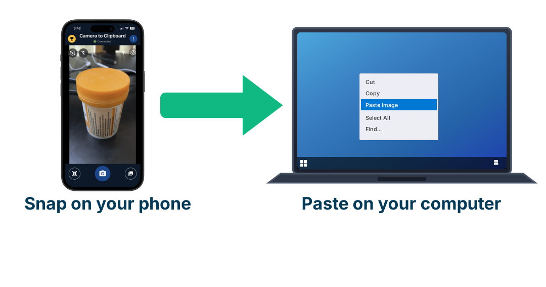
Use Camera to Clipboard to test a banner in the real page
The largest measured effect on this page is about where the ad sits, and a design tool cannot show you that, because it shows you the banner and not the page around it. What settles the question is a picture of the actual page with your banner dropped into the slot it would occupy, and on a phone that page is a screenshot. Camera to Clipboard, one of my own apps, moves that picture onto your computer in one step.
- You can send pictures already sitting in your phone's library, one or several at once, so screenshots of three candidate placements arrive on your computer together. They land on the clipboard ready to paste, with no emailing them to yourself, no cable and no upload to somebody else's website in between, because the phone and the computer talk over your own local network.
- The same banner was looked at 58 times among the content and 10 times in a fixed slot at the top, so the choice worth testing is the slot rather than the artwork. That is a comparison you can make in about a minute with two pasted screenshots, and no amount of redrawing the banner will produce a difference of that size.
- Pasting into Photoshop or GIMP drops the page screenshot in as a new layer, so you can slide the banner around the page and see where it lands. Eight looks in ten fall on the left half of the screen and the busiest spot is about 600 pixels in from the left edge, which is easy to check against a real screenshot and impossible to check against a blank canvas.

Trying to stand out is exactly what gets a banner skipped
Here is the contradiction at the centre of this whole subject. Design advice says stand out. The eye-tracking says that on a web page, looking different from what surrounds you is precisely how you get skipped.
- Nielsen Norman Group's stated reason that readers ignored an element was that it "looked different from the text and the photography on the site". Standing out was the diagnosis, not the cure. The thing they ignored got one look out of every 132 that landed on the page.
- Sponsored posts in a realistic Instagram feed were looked at 23% fewer times than organic posts, and the gap was a big one. A 2025 study of 152 people in Frontiers in Psychology recorded 5.00 looks at a sponsored post against 6.52 at an organic one, a gap far too large to be luck. These were built to look exactly like the posts around them, not banners stuck in a side column, and they were still skipped.
- People spent almost as long on a sponsored post, but they looked at it far fewer separate times. The total time was only about 3% lower, while the number of separate looks was 23% lower. So people glance at an ad once, decide, and move on, instead of looking back at it two or three times the way they do with a post they like.
- The call-to-action button gives away that a post is an ad more strongly than the word "Sponsored" does. In that study the button accounted for 54.2% of the real effects against 41.7% for the disclosure label, and when a reader's eye hit one of those markers early, the time they gave the post fell in 80.6% of the cases that held up. Your button is doing more to mark you as an ad than the legally required label is.
- The "Sponsored" label has to stay, so the parts you can actually change are the colours, the photography, the typography and the layout. Nielsen Norman Group listed a coloured background as one of the things that marked an element out as advertising, alongside its shape and its fancy formatting. Those four are what a reader is really using to sort ads from content. The disclosure has to stay, because concealing that an ad is an ad is what regulators act on. What you can change is the photography, the typography and the layout, and those are the parts the reader is actually using to classify you.
- Making an ad blend into the feed still beats a banner in a side column by a wide margin, even after all of that. Being looked at 23% less than an ordinary post is a far better place to be than the side column, which gets ignored 33 times over. Blending in is a big improvement that gets oversold as a cure.
- Rough, home-made-looking ads beat expensively produced ones in Meta's own 2026 study. Rough content is 14% of all social ads but 42% of the top-performing ones in one large agency dataset. This is the same finding from the other direction: matching the feed beats out-producing it.

Animation buys attention and loses you the customer
Search for how to make a banner stand out and the first advice you meet is to add movement. This is the one area where the research is genuinely split, so here is both sides, and then the thing that resolves it.
- Several studies do find that animation raises attention, and that side of the argument is real. A 2012 study found people looked more often as the animation got busier, and remembered the banner better; a 2004 study found animated banners beat static ones on attention, recall and attitude; a 1999 study found quicker responses and better recall. Anyone telling you motion attracts the eye has papers to point at.
- Other studies find animation makes no difference at all, and one found its effect flips depending on whether the reader is searching or reading. A 2010 study concluded that "on average, animation had little or no effect on attention", helping skyscrapers and hurting banners. A 2014 study of 24 people found that during a word search animation drew more and longer looks, while during reading for comprehension static drew the longer looks, with a very large interaction between task and animation.
- People remembered some of the still banners and remembered nothing whatsoever of the animated ones. That is the one place every study agrees, and it is not a small gap. In the Oregon study, answers about the animated banners were no better than if people had picked at random, while answers about the still ones were genuinely better than that. The difference between the two was too big to be luck. A 2005 study found that how well people remembered an ad and how much they liked it both peaked at a moderate amount of animation and fell away when there was more of it, with fast motion producing unpleasant feelings that stopped people remembering it.
- The commercial data settles the animation question by separating clicks from customers, and moving ads win the click while losing the customer. Across 67,000 Facebook ads on more than 100 accounts, video beat static on click-through by 1.9% to 1.1% and on engagement by 5.2% to 1.4%, while costing $48.20 per customer against $34.50, making static about 28% cheaper for an actual buyer. A media agency reviewing six standard display sizes from 2017 to 2021 found near identical click-through between static and animated.
- Animated banners slowed readers down more than still ones, taking 7.5% longer against 6.3% to find what they came for. The irritation is real, it has been measured, and the reader pays it rather than the advertiser. Flashing text was the worst of the lot. It was the only kind of banner that measurably made the job feel harder, and when something people were looking for sat between two flashing banners, it took them 75% longer to find.
So the honest summary is that motion does get looked at, and that looking is worth less than it costs. If you are paying per customer rather than per click, the cheap change is deleting the animation.

Plain text gets looked at more than a picture
Three separate sources, across nearly twenty years, point the same way, and none of them is cited by any of the design-tip articles that rank for this subject.
- A 2023 eye-tracking study of 67 people found text banners were skipped less often and remembered better than picture banners. Published in Cognitive Processing, it compared text-type and picture-type banner ads across 16 pages. The same study found that matching the ad's theme to the page did nothing for how long people looked, though it did help them remember it.
- Nielsen Norman Group have listed plain text since 2007 as one of the few things that reliably pulls a gaze into an advertisement. Their finding was qualitative rather than numeric, but it has survived three rounds of their own eye-tracking, and it sits oddly beside two decades of advice to make banners more visual.
- Benway and Lane's 1998 result was that a plain highlighted text item inside a menu did not trigger banner blindness at all, while banner-shaped elements did. Readers used the highlighted text and said they preferred it. Making something stand out worked when it sat inside the text people were reading, and stopped working the moment the same emphasis moved into a banner.
Bold text is the cheapest change you can make to a banner
Given that words work better than pictures, the next question is how those words should look. There is one real answer, one honest gap, and two rules people follow that were never measured.
- Setting the words in bold got an entry looked at 42% more often, and that beat paying to print the whole advert in colour. It comes from a study of how people read printed phone directories. Setting an ordinary text-only entry in bold cost nothing and bought 42%. Paying to have a whole advert printed in colour bought 21%. It is the cheapest change in this entire article, it needs no designer, and almost nobody mentions it.
- Meta still advises keeping image text under 20% and still publishes no data supporting it. The old rule that rejected ads over that threshold was quietly retired in September 2020, with Meta telling advertisers "we will no longer penalize ads with higher amounts of image text in auctions and delivery" and never issuing a formal announcement. The help page continues to say images with less than 20% text perform better.
- The 125-character and 27-character limits in Meta's ad guide are truncation points, not performance findings. Text past those lengths gets hidden behind a "See More" link. No study is published behind either number, so writing to them is a layout decision and nothing more.
- Nobody has tested what colour the text itself should be. Every colour study I could find measured the whole advert, or a button, never the words. So there is no evidence that dark blue type beats black, or that white on navy beats navy on white. Make it easy to read against whatever sits behind it and spend the saved time somewhere that has been measured.
So the whole of it: use words rather than a picture, set them in bold, make them readable, and ignore the 20% rule.

A face works only when it is looking at your product
"Put a human face in it" is one of the oldest pieces of advertising advice. It has been measured properly exactly once that I could find, and the result is narrower and more useful than the advice.
- A static face did not make people any likelier to look at the banner than no face at all. Palcu, Sudkamp and Florack eye-tracked 137 people across banners with a face looking at the product, a face looking away, and no face. The difference between a static face and no face at all was well inside what you would get by luck. The face alone bought no attention.
- A face with its gaze pointed at the product made a look at that product 4.1 times likelier. That is the real finding, it was too big a difference to be luck, and it is about which way the face is turned rather than about faces at all. What the model is looking at is where the reader looks, so a face staring out at the camera wastes the effect.
- Gaze direction changes whether the eye lands on your product, not how long it stays there. How long people looked at the product did not change with either the direction of the gaze or the animation. You are buying a glance, and the product has to do the rest of the work by itself.
- The face steals about two and a half times the attention the product gets, even when it is pointing at it. The face took 670 milliseconds against 270 for the product. With an animated face it got worse, at 1,084 against 279. Adding a person is a trade, not a free win.
- The famous baby eye-tracking study that everybody cites has no numbers in it. James Breeze's 2009 test of 106 people, the one with the heat maps of an infant looking at a headline, was published as an agency blog post, never peer reviewed, and has never reported a single count of looks, a single measure of how long people looked, or any check on whether the result could have been luck. The conclusion happens to survive because Palcu measured it properly, but the evidence normally quoted for it does not exist.
- Which gaze direction wins reverses by category, so there is no universal rule. In VidMob's corpus of 1.1 million ads, looking straight at the camera lowered cost per install by 10% for a mobile game and raised three-second view rates 59% for financial education, while looking away raised click-through 44% for financial products. Direct gaze won for education and gaming, indirect for sports, lifestyle and medical.
One caution on the last point: those are individual results picked out of a huge library of ads by the company that sells the analysis, not controlled tests, and they never say how likely the results were to be luck.

How big your banner is beats how much it stands out
Every banner guide tells you to make the design bold and high contrast. The research on where human eyes actually land says standing out is the weakest of the three things competing for that job.
- How big something is predicts where people look about twice as well as how much it stands out. A review of 19 eye-tracking studies scored how well each one predicted where people actually looked. How big something was scored 0.51 to 0.58, and how much it stood out managed only 0.19 to 0.31. The returns on size taper off rather than growing in a straight line, so small increases help more than large ones.
- What a thing means predicts where people look better than how it looks does, by 52% against 30%. Researchers scored parts of a scene both for how much they stood out and for how much they meant something, and meaning explained far more of where the eyes went. Once the overlap between the two was stripped out, standing out explained nothing at all on its own.
- A model that simply guesses "people look at the middle" outperforms the standard visual-contrast model. On the main test of predicting where people look, simply guessing the middle scores 0.78 and the classic contrast model scores 0.60, where 0.50 is what pure guesswork scores and a human scores 0.80. Any tool selling you a heat map of what stands out in your banner is selling something that predicts looking worse than simply assuming the middle.
- Cramming in more detail, edges and colours measurably hurts attention to your brand. Across 249 advertisements, dense visual busyness reduced brand attention and made people like the ad less, while a deliberate, well-organised layout helped both. More stuff is not more contrast.
Which colour you pick has never been shown to matter
Two different questions get mixed up here, and separating them clears up most of the confusion. Whether to use colour at all does have an answer, and it is a modest yes, worth a bit more looking time. Which colour to use, red against green against blue, has no answer at all, and that is where almost every famous piece of colour advice lives. This section is about the second question.
- The one colour decision with real evidence behind it is taking your colours from the page you sit on. Nielsen Norman Group named a coloured background as one of the tells that marked an element out as an advert, alongside its shape and its fancy formatting. So the useful move is to draw your colours from the page or feed around you rather than from your brand guidelines. Nobody has measured what that is worth on its own, so treat it as a direction rather than a number. It also does not mean hiding that the ad is an ad, because concealing that is what regulators act on.
- "Red converts best" comes from a test where the losing green was the client's own brand colour. The famous 2011 result that red beat green by 21% ran on a page where green was used throughout, so the green button blended in and the red one did not. The company said itself that the result does not generalise. Several other famous button tests compared a coloured button against having no button at all.
- The same colour produces opposite commercial results depending on how you are selling. Using real auction data, a red background raised how much people bid in an auction and lowered what they offered in a negotiation. That is the cleanest reason to distrust any rule of the form "colour X drives outcome Y".
- The two famous statistics claiming colour decides how people judge a product were both made up. These are the ones quoted to argue that picking the right colour changes minds, which is a different claim from colour simply getting an advert noticed. The first is that up to 90% of what someone thinks of a product comes from its colour alone. That traces back to a single unreferenced sentence at the start of a review paper, with no study behind it. The second is that colour increases brand recognition by 80%. That traces back to a Xerox marketing leaflet, which had twisted a 1990 study about reading graphs on black-and-white computer screens. The 80% figure appears nowhere in the original research.
One catch worth naming: that 21% came from a printed phone directory, where standing out from the page was the whole point. On a web page it cuts both ways, because standing out from the content around you is also exactly what gets a banner skipped. So the safe reading is to use enough contrast inside the banner that the words are easy to read, and to stop worrying about which colour that is. Every confident claim that a particular colour wins turns out to be built on nothing.

You get 1.7 seconds, so design for a single glance
Facebook published the number everyone quotes, in April 2016: people spend 1.7 seconds with a piece of content in a mobile feed against 2.5 seconds on desktop, and a quarter of a second in front of someone is enough for them to remember having seen it. Two honest caveats: it is Meta measuring its own product, and while Meta published a full method for the ad study on that page, it published no method at all for the 1.7 and 2.5 second figures themselves. It is a vendor claim, a decade old, and it is still the best public figure there is.
- Making the banner taller does not buy it a single extra millisecond on screen until it passes twice the screen height. While the banner is shorter than that, the time it spends at least half visible is simply the screen height divided by the scroll speed, and the banner's own height makes no difference to the answer. Past twice the screen height it can never get half its pixels in view, so it can never count as seen at all.
- The only two things that change how long your banner is on screen are the reader's scroll speed and their screen height. Neither is something you control from the design file. This is the strongest reason to treat stopping the scroll as a question of where you buy the ad rather than what you draw on it.
- At a brisk phone scroll a banner clears the one-second bar with almost nothing to spare. That is what sits behind the numbers in the next section, and it is why tall banners do better. They are not more persuasive. They simply survive more of the scroll.
So build the banner for one glance. One idea, in words big enough to read without stopping, and no second thing competing with the first. You cannot buy yourself more time by designing harder, because the two things that decide how long your banner is on screen both belong to the reader.

Only one in four people stop three seconds on a video ad
"Scroll stopping" does have a real unit. On Meta it is the hook rate, the share of people shown a video ad who stay for three seconds. Billo measured it across more than 80,000 Meta video ads carrying $105 million of spend between July and December 2025.
- The average hook rate across every industry was 24.42%, and it barely moved all half-year. The monthly range was 23.81% to 24.70%, which is under one percentage point of variation across six months. Roughly one person in four stops for three seconds, and that is what normal looks like.
- Exactly one industry in one month broke 30%, which was health and beauty in December at 30.56%. Out of fourteen industries across six months, that is one result in eighty-four. The advice that 30% is merely solid and 40% is elite describes a distribution that does not exist.
- The spread between the best and worst industry was 8.5 percentage points, from health and beauty at 28.34% down to pet supplies at 19.80%. What you sell moves your hook rate more than any month of the year does, so benchmark against your own industry rather than against the overall figure.
- TikTok counts a stop at two seconds while Meta counts it at three, so hook rates from the two platforms are not comparable. A TikTok number will look better than a Meta number for the very same ad, because the bar is lower, which is worth knowing before anyone shows you a cross-platform chart.
- Across 578,750 Meta ads and $1.29 billion of spend, only about 5% ever took off. Motion counts an ad as a winner when it takes at least ten times the typical spend in its account and at least $500, which puts it in the top 8%. Those few winners soak up 55% of all the money spent. Most banners you make will do nothing, and that is the normal outcome rather than a failure of craft.
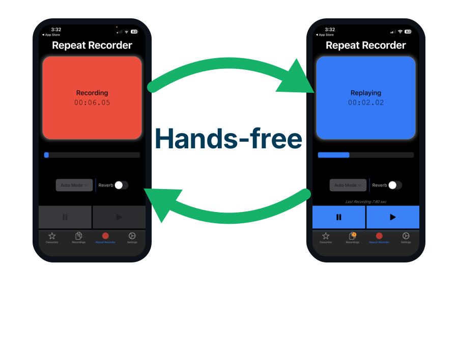
Use Repeat Recorder to try twenty openings for a video ad
One person in four stops for three seconds and about one ad in twenty ever takes off, so the sensible response is more attempts rather than one more careful attempt. The cheapest attempt anyone can make is a different opening sentence, and twenty of those cost less than re-editing a single video. Repeat Recorder, another of my own apps, records you, plays the take straight back and starts recording again without you touching the phone.
- Repeat Recorder replays each take and then starts recording again on its own, so twenty different opening lines take a few minutes and no button pressing. That is the entire app. It was built for speech rehearsal, language learning and vocal training, and saying an ad opening twenty ways is the same drill with different words.
- Only about 5% of Meta ads ever took off, and those few soaked up 55% of all the money spent, so the number of attempts you can afford matters more than the polish of any one of them. Hearing twenty openings back is the fastest way to find the one that earns the three seconds, and it costs nothing but the minutes.
- Takes worth keeping go into favourites and into folders you name yourself, which you can drag into whatever order you want. The three or four openings that survive a second listen become the shortlist you actually film, instead of the first line you happened to write on the day.

A third of display ads never get onto the screen at all
Before any of the design argument applies, the ad has to be on screen. The industry standard for that is lower than most people assume, and a large minority of ads still fail it.
- The industry counts an ad as seen when half of it is on screen for one whole second, and that is the entire test. For video it is two seconds, and for very large display units above 242,000 pixels the requirement drops to only 30% of pixels. Nothing in the standard requires that a human eye ever moved toward the ad.
- Only 67.9% of banner ads managed even that in July 2026, so about a third never cleared the bar at all. Integral Ad Science measured it across more than 300 billion daily interactions. Video reached 79.7%, nearly 12 points ahead of display.
- Ads on phones browsing the web are the worst on every measure, managing 64.5% against 71.6% on desktop. The same report found that phones browsing the web account for 45.1% of all the ads shown outside apps, but 71.5% of the clutter and 71.9% of the ads on junk sites built purely to carry advertising, at four times the desktop rate. Buying mobile web display without exclusions is buying that mix.
- Lumen Research finds around 70% of the ads that do clear that bar are still never actually looked at. Put the two together and roughly one banner ad in five gets any human attention at all. Treat that as an estimate combining two sources rather than as one measured figure.
- Nearly 30% of internet users run an ad blocker, so a large share of the audience never enters the auction. GWI's 2025 survey puts it at 29.5% globally and 1.77 billion people, with the United States at 32.5% and Indonesia highest at 40.1%. The most common reason given, by 63.5%, is simply that there are too many ads.
- The best place on a page is just above the point where you have to start scrolling, not the very top. Google found 68% of ads were properly on screen above that point against 40% below it. The very top does worse than you would think, because it scrolls away before the reader has settled.

Tall banners stay on screen and wide ones scroll away
Size does have measured effects, but not the ones the guidance implies, and the reason is mechanical rather than aesthetic. Meetrics measured how often each size was properly on screen, and for how long, across several billion ads shown in Europe.
| Standard unit | How often it was on screen | Time in view | Desktop click-through |
|---|---|---|---|
| 160x600 wide skyscraper | 72% the best of the five | 27.8 sec | 0.082% the best of the five |
| 300x600 half page | 70% | 29.1 sec the longest | 0.057% |
| 300x250 medium rectangle | 58% | 20.6 sec | 0.051% |
| 970x250 billboard | 55% | 14.3 sec | Not measured in this dataset |
| 728x90 leaderboard | 51% the worst of the five | 15.5 sec | 0.040% the worst of the five |
- Tall banners beat wide ones both at staying on screen and at getting clicked, because they survive the scroll. A skyscraper stays in the viewport while the reader moves down the page. A leaderboard sits at the top and is gone. The 970x250 billboard is physically the largest unit in the table and has the shortest time in view of any of them, which rules out "bigger is better" as the explanation.
- Which device the ad runs on changes click-through about four times more than which size you pick. Across 2.78 billion ads shown, desktop banners were clicked 0.051% of the time and mobile banners 0.209%. The gap between the best and worst size on either device is smaller than the gap between the devices, so any size comparison that does not split by device is really measuring the device mix.
- Google's list of "top performing" ad sizes is about advertiser demand and publisher earnings, in Google's own words, not about clicks. The stated reason for recommending 300x250, 336x280 and 728x90 is that they "tend to have more ad inventory available from advertisers". Quoting that list as evidence about which ads work is a category error, and Google's own 2014 measurement put 300x250 last for staying on screen.
- Sitting too far down the page accounted for 41% of ads that were never properly on screen, and being there too briefly accounted for another 22%. So nearly two thirds of the time an ad fails to be properly on screen, the reason is where it sat and how long the page stayed still, not how it looked.
- The advertising industry's standards body tried to abolish fixed banner sizes in 2017 and everybody went on buying and selling them in pixels anyway. Its New Ad Portfolio moved to flexible aspect ratios with minimum and maximum ranges. Nine years on, the same eight fixed sizes are what publishers sell.

Everyone quotes 0.46% but the real banner click rate is 0.27%
Before you judge your own numbers, check what you are being compared to. The most quoted statistic in banner advertising is roughly double the real figure, because it is a genuine measurement from 2017 being passed off as current.
| Where the ad runs | Click-through rate | How current the data is | How well sourced it is |
|---|---|---|---|
| Google Search | 6.64% the outlier | Apr 2025 to Mar 2026 | 13,474 campaigns, method published |
| Meta feed, leads campaigns | 2.59% | Apr 2024 to Jun 2025 | 726 campaigns, a small sample |
| Meta feed, traffic campaigns | 1.71% | Apr 2024 to Jun 2025 | 554 campaigns, a small sample |
| Google Display Network | 0.46% | Aug 2017 to Jan 2018, sold as current | 14,197 accounts, method published |
| Mobile display, any size | 0.209% | Roughly 2017, recycled as 2026 data | 2.78 billion ads shown, one platform |
| Desktop display, any size | 0.051% the floor | Roughly 2017, recycled as 2026 data | 2.78 billion ads shown, one platform |
- The famous 0.46% display click-through rate is WordStream data collected between August 2017 and January 2018. It is a genuine measurement of 14,197 advertiser accounts and more than $200 million of spend, reported as medians. It is also nine years old, it sits at a URL dated 2016, and the page carries a 2026 "last updated" stamp, which is how it keeps getting cited as current.
- The best recent figure for a banner click rate is 0.27%, barely more than half the 0.46% everyone still quotes. It covers the second quarter of 2024 and comes from advertisers reporting their own results, with no sample size published, so treat it as the best available rather than as good. It is the only recent independent measurement I could find, and it points down rather than up.
- Nobody publishes a properly measured current banner click rate at all. WordStream stopped: their 2026 report covers search only. So the honest position is that the industry's most quoted statistic is nine years stale and nothing has replaced it. If someone benchmarks your campaign against 0.46%, they are comparing you to 2017.
- Every "2026 click-through by ad size" table circulating online is the same 2017 platform dataset with the date filed off. The figures of 0.082%, 0.051% and 0.040% come from a whitepaper published in March 2018 covering the preceding six months. They now appear on multiple current-year benchmark pages with no attribution.
- Search outperforms display on clicks by roughly 15 to 25 times, but the two sides of that ratio come from different years and different methods. 6.64% against 0.46% is the honest comparison to make out loud, along with the fact that it is not a like-for-like measurement. The gap is real and large; the precision is not.
So the number to plan against is about a quarter of one percent, not the half a percent you will be quoted, and lower still on desktop. If a thousand people are shown your banner, expect two or three clicks.

Banner blindness got worse and now hits anything ad-shaped
One last thing worth knowing before you spend a week on the artwork. This has been getting worse rather than better, in two separate ways: the habit of skipping ads is as strong as it ever was, and it has spread to things that are not even ads.
- Nielsen Norman Group have documented banner blindness in 1997, 2007 and 2018 and call it strong and robust with no sign of weakening. Three studies, three decades, the same result. Over the same period the industry got dramatically better at the mechanical part of the job. The share of ads that were properly on screen went from about half in 2014 to roughly two thirds today. Ads are far more present on screen and no more looked at.
- Banner blindness has widened from advertising to anything that merely looks like advertising or sits next to it. Readers now skip content that resembles an ad, sits next to an ad, or occupies a position where ads normally live, whether or not it is an ad. The reflex is about shape and location, which is why moving the ad helps more than redrawing it.
- The most-cited banner blindness number in existence rests on six people. Benway and Lane's famous result, that people succeeded on 58% of tasks needing a banner click against 94% on ordinary ones, came from a trial run with six participants who each did only four of the tasks that mattered. The authors said so plainly and called it a pilot. Their larger follow-up with 72 people is the one worth quoting, and it found only 20% of participants recalled seeing any advertising at all.
- Benway and Lane refused to conclude that people never see banners, which is the claim their study is usually cited for. Their words were that the studies do not show users never see banners, "just that they are less likely to see and use banners than they are to use simple text links". They also found that plain banners which were not advertising at all got missed too, so part of this is about anything eye-catching sitting outside the text people are reading, rather than about hostility to advertisers.
Conclusion: what actually makes a banner scroll stopping
- Where the banner sits decides more than anything you can draw on it. The same banner was looked at 58 times when it sat among the words people were reading and 10 times in a fixed slot at the top, and the strip of ads down the right-hand side of a page filled a quarter of it for fewer than one look in a hundred. Spend the effort buying a slot inside the content, because no redesign closes a gap that size.
- Making a banner look eye-catching backfires, because readers skip whatever looks like an advert. A fully designed advertisement was looked at 13.0% of the time against 8.8% for a blank grey rectangle, a gap small enough to have been luck, so all the artwork bought was about four percentage points of eye contact. Nielsen Norman Group's stated reason readers ignored an element was that it "looked different from the text and the photography on the site", and Meta's own 2026 study found rough, home-made-looking ads beating expensively produced ones.
- Set the words in bold, delete the animation, and point any face at your product, because those are the cheapest changes with real measurements behind them. Bold got an entry looked at 42% more often, still ads cost $34.50 per buyer against $48.20 for video, and a face with its eyes on the product made a look at that product 4.1 times likelier. Which colour you pick has never been shown to matter, so use enough contrast that the words are easy to read and stop there.