A paywall is the one screen in a mobile app where a stranger decides to pay you. Almost every guide to designing one is a list of opinions, so this article is built only on measured results: RevenueCat's 2026 report on 115,000 apps, 40 million paywall opens counted by Superwall, Adapty's data on 16,000 apps, a seven month field study published in Management Science, and named redesigns where the app said what it earned.
The short version: the parts of a paywall that pay are structural, not decorative. Put a free trial on the plan, because a paywall with one converts 10.9% of the people who see it and a paywall without one converts 3.6%. Show it in the first session, because 89.4% of trial starts happen on the day of install. Split it across screens, because multi-page paywalls converted 12.41% against 9.07% for single-page ones. Draw a picture of when the money leaves the buyer's account, which won Blinkist 23% more trial signups. Then change the price and the plans before you change the artwork, because tests on artwork and wording win only 34.6% of the time.

Show the paywall in the first session, because 89.4% of trial starts happen on install day
Most developers hold the paywall back so they do not annoy anybody. The data says the person who was going to pay you has already gone.
- 89.4% of all free trial starts happen on the same day the app is installed, measured by RevenueCat across more than 115,000 apps.
- About half of all paid conversions also happen on install day, so the first session is not one chance out of many, it is most of them.
- Every app session after install day produces fewer trial starts than the one before it, because the people who came back were mostly going to pay anyway.
- The fitness app FitnessAI moved its paywall in front of onboarding and doubled its revenue. Half again as many people saw the paywall, twice as many started a trial, and the share of trials that turned into payments did not move.
- The anxiety app Rootd moved its paywall to the start of onboarding and multiplied its revenue by five.
89.4% of free trial starts happen on the day the app is installed, across 115,000 apps. A paywall the user reaches on day three is a paywall almost nobody reaches.
Where you put it inside that first session still matters, and the trade is between how many people see it and how warm they are when they do.
| Where the paywall sits | Share of installs that reach it | How ready the person is | Evidence |
|---|---|---|---|
| First or second screen | 85% to 95% of installs see it | Cold, they have not used anything yet | RevenueCat, 115,000 apps |
| After onboarding questions | 30% to 60% of installs see it | Warm, the app just showed them a plan | RevenueCat, 115,000 apps |
| After the first useful action | Lowest, most people quit before it | Warmest, they have felt the app work | Adapty, 16,000 apps |
| Only on a locked feature | Lowest, only the curious tap it | Warmest, they asked for the thing | Adapty, 16,000 apps |
| In the settings menu | Almost nobody ever opens it | Already sold, they went looking | No published dataset |

Gate the whole app, because hard paywalls turn 10.7% of downloads into payers and freemium 2.1%
A hard paywall means nobody uses the app without paying or starting a trial. Freemium means the app is free forever and you sell extras.
- Hard paywall apps turn 10.7% of their downloads into paying customers within 35 days, and freemium apps turn 2.1%, which is roughly five times as many.
- Hard paywall apps earn $3.09 for every install by day 60, and freemium apps earn $0.38, which is eight times as much for the same number of downloads.
- People who buy through a hard paywall stay as long as people who buy inside a free app, because yearly subscribers renew at 27% on hard paywall apps and 28% on freemium apps.
- Freemium earns 12 cents per install for every dollar a hard paywall earns, and the renewal figures say the extra goodwill it is supposed to buy does not exist.
- Freemium still wins if your app needs other users to be useful, because a chat app or a marketplace with 2% of its downloads inside it is a dead app whatever the money figures say.

Put a free trial on the plan, because a paywall with a trial converts 10.9% of views not 3.6%
This is the cheapest change on the list and the largest one you can make in an afternoon.
- Paywalls offering a free trial convert 10.9% of the people who see them, and paywalls without one convert 3.6%, measured by RevenueCat as the median across every app category.
- Adding a free trial to a weekly plan raised what the average customer spent over 12 months from $7.40 to $54.50 in Adapty's data, which is more than seven times as much.
- A free trial works because zero is not just a low price, it is a different kind of decision. Shampanier, Mazar and Ariely showed in Marketing Science in 2007 that people take a free item over a cheaper-in-total paid one even when the paid one leaves them better off.
- A PDF scanner app tested a monthly plan, a weekly plan and a weekly plan with a trial, and the trial version converted 2.29% of views against 1.21% for monthly. The change doubled that app's revenue.
- A trial is not a discount, because 9 out of 10 app subscriptions still sell at full price and only 9.3% of apps run any promotional offer at all.

Make the free trial longer than four days, because long trials convert 42.5% and short ones 25.5%
Nearly half the industry is doing the opposite of what its own data says, and the reason is that a short trial feels like it gets you paid sooner.
- Free trials lasting 17 to 32 days turn 42.5% of triallists into payers, and trials of four days or less turn 25.5%, measured by RevenueCat.
- Free trials of 5 to 9 days turn 37.4% of triallists into payers, which sits between the short and the long figure, so the effect is a steady climb rather than one odd result.
- 46.5% of apps still use a trial of under four days, up from 42.1% the year before, so the industry is moving away from the better number.
- A short trial concentrates the cancelling into the first hour, because 55.4% of three day trial cancellations happen on install day and 84% happen on the install day or the one after it.
- A long trial gives the app time to become a habit before the charge lands, which is the whole mechanism the conversion figures are measuring.

Ask a few onboarding questions first, because their answers become the paywall's headline
The screens before the paywall decide whether the paywall works, and most apps use them to explain features instead.
- A paywall shown during onboarding with a trial attached converts 1.35% of views, and the same offer shown later inside the app converts 0.89%, measured by Adapty across 16,000 apps.
- The strongest paywall headline repeats the goal the person typed into your onboarding three screens earlier, such as a goal weight, a target language, or a date they named.
- Delete any onboarding question that does not change something the person then sees, because an unused question is a screen where people quit for nothing.
- The video app Mojo gets about half of all its trial starts from its onboarding paywall, and raised its revenue per user 60% in five months by working on those screens.
- An LED light controller app tested six different onboarding designs and moved its conversion from 0.8% to 1.29% of installs, a rise of 61%, without changing the paywall screen itself.
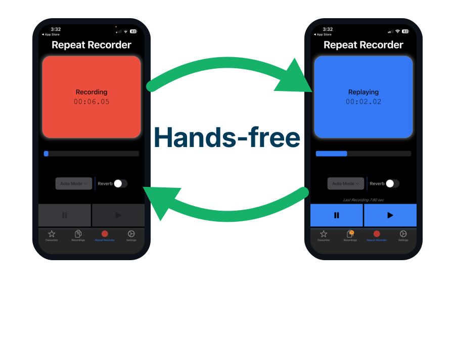
Use Repeat Recorder to rehearse the voiceover before you film a paywall video
Video paywalls are one of the patterns Superwall says is working right now, and Adapty measures video backgrounds lifting conversion by 8% to 15%. The hard part is the talking, because a paywall video is 15 seconds long and every word has to land. Repeat Recorder, one of my own apps, loops a short recording back at you so you can hear your own delivery over and over until the wording is right.
- Repeat Recorder plays your recording on a loop with no button to press between plays, so you can keep rehearsing while your hands are busy setting up the shot.
- You can set the gap between repeats, which is how you practise saying a line in the time the video gives you.
- Hearing your own paywall script back is the fastest way to find the sentence that sounds like an advert, and an advert is exactly what a paywall must not sound like.

Split the paywall over several screens, because multi-page paywalls converted 12.41% not 9.07%
This is the largest measured design finding available, and three quarters of the industry has not acted on it.
- Paywalls split across more than one screen converted 12.41% of the people who opened them, and single screen paywalls converted 9.07%, a gap of 37%.
- The multi-page finding comes from just over 40 million paywall opens between February and May 2026, counted by Superwall and limited to paywalls shown during onboarding.
- Only 24% of onboarding paywall opens are multi-page, so most apps are still cramming everything onto one screen.
- Splitting a paywall over several screens works because each screen makes one point instead of six, and the person taps forward through them rather than reading a wall.
- The wellness app OMENA rebuilt its paywall as a long scrolling screen with photos, testimonials, a founding story and a list of questions, and doubled its trial start rate.

Write the headline as the result the buyer wants, not the name of your subscription
The most common paywall headline in the App Store is the word Premium, which describes your pricing tier and not their life.
- The headline should name the outcome the person came for, in the words they used to describe it.
- Naming your product tier tells the reader what you are selling, and naming the outcome tells them what they are buying.
- Superwall's design lead, working from more than 4,500 A/B tests, found that simplifying the headline and the plan names alone was worth about 10%.
- A headline that makes a big claim invites the reader to judge the claim, and judging is how you lose them. Say the specific small thing instead.
- Repeat the exact number the person entered during onboarding, because a paywall that says your 12 week plan is ready is delivering something they asked for.
| Part of the screen | The version that loses | The version that wins | What the swap is worth |
|---|---|---|---|
| Headline | Unlock Premium | Your 12 week plan is ready | Part of a measured 10% lift |
| Headline, fitness app | Go Pro today | Reach 72 kg by 14 November | Named as best practice, not measured alone |
| Buy button | Put AI Into Action | Continue | 111% in one Superwall test |
| Line above the button | Nothing there | No payment due now | Superwall calls it a repeat winner, unquantified |
| Price | $99.99 per year | $0.27 a day, billed yearly | Standard practice, no public figure |
| Plan names | AI Assistant Annual Membership | Yearly | Part of a measured 10% lift |
| Proof | Trusted by thousands | 4.8 stars from 140,000 reviews | 5 or more reviews raise purchase odds 270% |

Draw a timeline of the free trial, because Blinkist's lifted signups 23% and cut complaints 55%
The reason people do not start your free trial is not the price. It is that they expect to forget to cancel and be charged.
- Blinkist drew a three point timeline on its paywall showing today, the reminder day, and the day the card is charged, and trial signups rose 23%.
- Jaycee Day, the designer who ran Blinkist's paywall test, found the biggest single hesitation was forgetting to cancel and being charged, so the screen was rebuilt to answer only that fear.
- The same change took Blinkist's push notification opt-in rate from 6% to 74%, because the notification was now obviously for the user's benefit rather than the company's.
- Customer complaints fell 55% and the share of triallists still there at the end rose 4%, so the honest version was better on every measure at once.
- Say the reminder day out loud on the screen, for example we will remind you on day 5 and charge you on day 7.

Write No payment due now above the button, because surprise billing is the fear you are answering
Superwall calls this the tweak that keeps working, and it costs one line of text.
- Put the words No payment due now directly above the buy button, where the thumb is already looking.
- Add No commitment, cancel anytime under the button as the second half of the same promise.
- The words No payment due now work because a free trial that asks for card details does not feel free, and the sentence closes the gap between what is true and what it feels like.
- RevenueCat found that spelling out how to cancel is linked to more trials being started, at the cost of slightly more people leaving early who were never going to pay.
- Never write No payment due now if a payment really is due now, because a charge the buyer did not expect becomes a refund, a one star review and a chargeback.

Put your star rating and review count on the paywall, because 5 reviews raise purchase odds 270%
The person is deciding whether to trust you and whether to pay you, in that order, and most paywalls only argue about the price.
- Products with five or more reviews are 270% more likely to be bought than products with none, measured by the Spiegel Research Center at Northwestern University.
- A perfect five star rating sells worse than a 4.2 to 4.5 star rating, in the same research, because a flawless score reads as fake.
- Put the rating right next to the price, not at the bottom, so the reader has decided you are trustworthy before they read the number.
- Real App Store reviews with names beat a sentence saying trusted by thousands, and two of RevenueCat's four published paywall redesigns swapped a feature list for real reviews.
- One food app replaced its paywall feature list with real App Store reviews and one impact figure, and gained 72% more trials per install.

Show two or three plans and pre-select the yearly one, because a fourth option only adds hesitation
Choosing between plans is work you are asking the buyer to do, and every extra row is more of it.
- Mojo made the yearly plan the default and moved the monthly plan behind a link, and yearly signups rose 15% to 20% with only a small rise in cancellations.
- One party game app removed the monthly plan from its main paywall screen and gained 31% more trial starts per install and 64% more revenue.
- Two or three visible plans is the working range, and a fourth is a decision you are outsourcing to a tired person.
- Iyengar and Lepper's famous jam experiment found 30% of shoppers bought from a table of six jams and 3% bought from a table of 24, though later reviews of many similar studies found the average effect close to zero, so treat it as a reason to test and not as a law.
- Adapty found that changing the number of plans wins 57.1% of the tests it is used in, which puts it among the most reliable changes you can make.

Break the price down to a day or a week, because $0.27 a day and $99 a year are the same offer
The yearly total is the number that makes people close the app, and it is the number the store makes you show. Show both.
- Print the small unit first and the real billing amount underneath, for example $0.27 a day, billed as $99 once a year.
- Do the division for the reader, because a person who has to do arithmetic on your paywall is a person who has stopped buying.
- Superwall's team describes showing $39 a year as $0.76 a week as a completely different decision for the reader, which is the whole reason to do it.
- Raising the price usually earns more even when it converts less, because apps that moved a weekly plan from $7.99 to $9.99 lost 5% to 8% of conversions and gained 18% to 22% in revenue per user.
- A customer of a high-priced app spends about three times as much before they cancel as a customer of a low-priced app, so being cheap is not a growth strategy.

Label the buy button Continue and colour nothing else, because a plain button won a test by 111%
The button is the only thing on the paywall that earns money, and most apps hide it behind clever wording and competing colours.
- A paywall with a picture, a headline and a Continue button beat a paywall with a detailed feature comparison chart by 111%, in a test run by Superwall's design lead.
- Continue beats a clever phrase because a clever phrase sounds like a sales pitch, and Put AI Into Action was the losing version in that test.
- Make the buy button the only coloured element on the screen, which is RevenueCat's own published advice and matches the redesigns that worked.
- The word Continue also promises there is another step, which is easier to agree to than a purchase.
- The golf app Golf GameBook changed its paywall background from dark green to white and lifted trial conversions, which says contrast around the button is doing the work and not the colour you like.
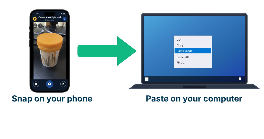
Use Camera to Clipboard to get rival paywall screenshots onto your computer
Copying the best paywalls in your category is the fastest research you can do, and every one of them lives on your phone. Getting those screenshots to the machine where you design is the annoying part, because emailing yourself pictures all afternoon is how the job dies. Camera to Clipboard, another of my own apps, puts what your phone camera sees straight onto your computer's clipboard so you paste it where you are working.
- You paste the image straight into your design file, with no email to yourself and no cable.
- Photographing a competitor's paywall off a second phone is often the only way to capture it, because many apps block screenshots on payment screens.
- Collecting 20 rival paywalls side by side is how you notice that they all use two plans and you are using five.

Let people close the paywall, because one developer found 84% of buyers bought after skipping it
A paywall with no way out looks like it converts better and often earns less, because the people who would have paid later never get in.
- One developer testing a forced paywall against a skippable one found 84% of their buyers bought after skipping the first paywall.
- A skippable paywall only earns more if the app behind it is worth walking into, because a skippable paywall in front of a dull app is just a lost sale.
- Make the close control small, grey and quiet rather than absent, which is the standard advice and keeps the buy button as the obvious thing to press.
- Delaying the close control by a few seconds forces the paywall to be read, but that same delay is the kind of thing regulators are now fining companies for, so read the last section before you add it.
- Show a second smaller offer when somebody taps the close control, which is the pattern Superwall found across its test set and costs nothing to add.

Make the paywall look like a plain Apple screen, not a branded advert
The instinct is to make the paywall the most designed screen in the app. The tests say the opposite.
- Paywalls built to look like a native Apple screen beat heavily branded custom designs by a long way in Superwall's test set.
- A screen that looks like an advert gets read as an advert, and people have thirty years of practice at ignoring those.
- A screen that looks like part of the operating system reads as the app's ordinary next step.
- Strava, Headspace and Fishbrain have all moved from long benefit-packed paywalls to much plainer ones, which is the same direction the test data points.
- Design effort is worth spending on the offer and the wording, because the artwork is the part with the weakest evidence behind it.

Test the price and the plans before the artwork, because artwork tests win only 34.6% of the time
Adapty published the win rate of every kind of paywall test its customers ran, and the ranking says to fix the offer before the screen.
- Translating the paywall into the local language wins 62.3% of the tests it is used in, which is the highest of any change.
- Changing the free trial wins 59.6%, changing the plan length wins 58.7%, and changing the number of plans wins 57.1%.
- Changing the price wins 45.5%, and changing the artwork or the wording wins 34.6%, which is worse than tossing a coin.
- Mojo rewrote its paywall for Japan with a long scrolling layout and local social proof and gained 20% more conversions, and showed its prices differently in Latin America for 30% more trial starts.
- Wait for at least 200 subscriptions in each version before you believe a result, because a paywall test read early is a coin flip you have decided to trust.
34.6% the share of artwork and wording tests that produced a win, against 59.6% for free trial changes, across 16,000 apps. Redesigning the screen is the least reliable change you can make.

Print the real price and billing term in plain text, because Apple rejects paywalls that hide it
The most beautiful paywall in the world earns nothing if App Review sends it back, and this is one of the most common reasons they do.
- Apple's guideline 3.1.2 requires you to describe what the person gets and what it costs before you ask them to subscribe.
- Every plan must show its real charge and its billing period in text large enough to read, so a price that only appears once a toggle is flipped is a rejection.
- A working link to your terms of use and to your privacy policy has to be reachable from the paywall.
- Include a Restore Purchases control, because a paying customer on a new phone who cannot get their subscription back writes a one star review.
- A hidden toggle that quietly changes which plan is being bought is the exact pattern reviewers look for, so make the selected plan obvious at all times.

Make cancelling as easy as subscribing, because the FTC took $2.5 billion from Amazon over it
Several of the tricks that lift a paywall's conversion this month are the ones regulators are currently fining companies for.
- The US Federal Trade Commission settled with Amazon for $2.5 billion in 2025 over how people were signed up for and kept in Prime.
- Instacart settled for $60 million and Chegg for $7.5 million in the same year over subscription practices.
- Uber was found to put people through 23 screens and 32 separate actions to cancel Uber One, which is the shape of thing being punished.
- An appeals court struck down the FTC's specific click-to-cancel rule in July 2025, but the underlying law still applies and the agency began work on a replacement rule in January 2026.
- Making the cancel button quieter than the keep subscribing button is named in the enforcement actions, so the version of that trick on your paywall is a legal risk and not a growth tactic.

Every paywall element ranked by the evidence behind it
Sort this by evidence to see what is safe to copy, and by effort to see what you can do this afternoon.
| Paywall element | What the measurement says | Strength of the evidence | Size of the effect | Effort to build |
|---|---|---|---|---|
| Free trial on the plan | 10.9% of paywall views convert with a trial, 3.6% without | 115,000 apps, RevenueCat | Three times as many buyers | One afternoon |
| Hard gate, not freemium | 10.7% of downloads pay, against 2.1% on freemium | 115,000 apps, RevenueCat | Five times as many buyers | Rebuilds the whole product |
| Trial longer than four days | 42.5% of triallists pay, against 25.5% on short trials | 115,000 apps, RevenueCat | Up 67% on trial conversion | One setting change |
| Paywall in the first session | 89.4% of trial starts happen on install day | 115,000 apps, RevenueCat | FitnessAI doubled revenue | A few days of work |
| Split across several screens | 12.41% convert, against 9.07% on one screen | 40 million paywall opens, Superwall | Up 37% on paywall conversion | A few days of work |
| Translated into the local language | Wins 62.3% of the tests it appears in | 16,000 apps, Adapty | Mojo gained 20% in Japan | Every market separately |
| Two or three plans, not five | Plan count changes win 57.1% of their tests | 16,000 apps, Adapty | One app gained 31% of trials | One afternoon |
| Yearly plan pre-selected | Mojo gained 15% to 20% more yearly signups | One named app | Up 15% to 20% on yearly take-up | One afternoon |
| Drawing of the trial timeline | Blinkist gained 23% more trial signups | One named app | Up 23% on trial starts | A few days of work |
| Star rating and review count | 5 or more reviews raise purchase odds 270% | Spiegel Research Center | One redesign gained 72% of trials | One afternoon |
| Plain Continue button | Beat a feature comparison chart by 111% | 4,500 tests, Superwall | Up 111% in that one test | One afternoon |
| No payment due now line | Called a repeat winner with no figure published | 4,500 tests, Superwall | Never quantified publicly | One afternoon |
| Price shown per day | Named as standard practice with no figure published | No published dataset | Never quantified publicly | One afternoon |
| Video background | Adapty reports 8% to 15% more conversions | 16,000 apps, Adapty | Up 8% to 15% | Needs filming and editing |
| New artwork and new wording | Wins only 34.6% of the tests it appears in | 16,000 apps, Adapty | Loses about two times in three | A few days of work |
The four elements with the strongest evidence behind them are all decisions about the offer, and none of them is a decision about the picture.

Conclusion: the elements of a high converting app paywall, in one glance
Build the offer first and the screen second. These six are ordered by the size of the measured effect, and the table above holds the rest.
- Gate the whole app, because hard paywalls turn 10.7% of downloads into payers and freemium 2.1%.
- Put a free trial on the plan, because a paywall with one converts 10.9% of views and one without 3.6%.
- Make the trial longer than four days, because long trials convert 42.5% of triallists and short ones 25.5%.
- Show the paywall in the first session, because 89.4% of trial starts happen on install day.
- Split it over several screens, because multi-page paywalls converted 12.41% and single-page ones 9.07%.
- Change the price and the plans before the artwork, because artwork tests win only 34.6% of the time.