
Something has changed about the ads I see while reading. A lot of them no longer look like ads. They sit in the feed with the same typeface as the articles around them, or slide between two paragraphs looking like a recommendation rather than a banner, and I have caught myself reading one before noticing the little grey Sponsored label. That is not an accident, and it is not a trick a designer invented last year. It is the whole display industry reacting to a measured fact about human attention. This piece is what I found when I went looking for the evidence behind it: whether Google Display really is as cheap as everyone says (it is, and that turns out to be the least useful fact about it), whether Google's enormous pile of data really makes it effective (a real effect, much smaller than the pitch), and what actually separates a display ad that works from one that quietly burns a budget. I build small apps, so I use my own as the running example: Repeat Recorder, Paint Vlix and Camera to Clipboard. If you want the Search side of Google first, I wrote that up in How Google Ads Really Work, though you do not need it to follow this.
The short version: Display clicks really are about four times cheaper than Search clicks, and they convert about five times worse, so the cheap click is not a cheap customer. The largest clean evidence, a meta-study of 432 randomised experiments on the Google Display Network, found a real but modest median lift of about 16% in site visits and 8% in conversions, which is a long way from what the platform's own conversion column shows you. The ads stopped looking like ads because banner blindness is a reflex, and native formats measurably beat it: 53% more looks and 18% higher purchase intent in the landmark eye-tracking study. You get that native look in Google Ads not by designing it but by feeding the machine complete asset sets. Retargeting is the exception everyone recommends and the one this article does not: it wins every reported metric, but a holdout typically credits the ads with only about 27.5% of the sales they claim, which turns a reported $38 customer into a real $138 one. The biggest wins are usually subtraction: kill the app placements, cap frequency, and stop believing view-through conversions. And the format is moving under your feet, because Google is retiring standalone Display campaigns into Demand Gen through 2026 and 2027.

A Display click costs about a quarter of a Search click
Start by confirming the thing everyone tells you, because it is true and it is worth being precise about. On the most widely quoted Google Ads benchmark set, the gap is not subtle:
- Search clicks average around $2.69. That is the expensive end of the internet, and deliberately so, because you are buying someone who typed the problem you solve into a search box.
- Display clicks average around $0.63. Roughly a quarter of the price, which is where the "Display is dirt cheap" reputation comes from.
- You are usually really buying impressions, not clicks. Display is typically transacted around $3 per thousand impressions on the Google Display Network, with the common range running from about $2 to $10 depending on targeting and competition.
- The reach is genuinely enormous. Google puts the Display Network at more than two million sites and apps, reaching roughly 90% of global internet users. Whatever else is true, you are not short of inventory.
So the premise checks out. As raw traffic, Display is one of the cheapest things you can buy at scale anywhere. The interesting question is what happens next.
A note on these benchmark numbers, because you should not trust them too far. The famous Search-versus-Display comparison table gets recycled across dozens of "2026 benchmarks" posts, and much of it traces back to a WordStream dataset that is several years old. You can see the strain if you compare click-through-rate claims: one widely cited figure for Display is 0.46%, while more recent Display Network averages get quoted around 0.05%. That is an order of magnitude apart, which tells you something useful in itself.
Treat every number in this section as an order of magnitude, not a target. The direction of the gap is robust and reproduces everywhere. The decimal places are not. Your own account is the only benchmark that actually governs your decisions.

Display clicks cost four times less and convert five times worse
Here is where the cheap-clicks story quietly falls apart, and it is simple arithmetic rather than an opinion. The same benchmark set that gives you the cheap click also gives you the conversion rate:
- Search converts at roughly 2.81% for ecommerce.
- Display converts at roughly 0.59% for the same category. About one fifth as often.
- So the cost per conversion inverts. The same source puts ecommerce cost per action at about $45.27 on Search and about $65.80 on Display. The cheaper click produced the dearer customer, by roughly 45%.
- The arithmetic holds even if you distrust the CPA figures. Take the click prices and conversion rates on their own: $2.69 divided by 2.81% is about $96 per customer on Search, and $0.63 divided by 0.59% is about $107 on Display. Different route, same verdict.
The reason is not that Google's Display machinery is bad. It is that you are buying two completely different mental states.
- Search sells you intent that already exists. Someone has stopped what they were doing and asked for the thing. You are the answer to a question.
- Display sells you interruption of something else. Nobody on the Display Network was looking for you. They were reading a recipe, checking a score, playing a game. You are the thing in the way.
- Cheapness is the price of that difference, not a discount on it. The click is cheap because the intent is absent. Buying it and expecting Search-grade conversion is buying the wrong product and blaming it for not being the other one.
A cheap click is not a cheap customer.
The only number that pays your bills is cost per customer.
The only number that pays your bills is cost per customer.
This is the single most expensive misunderstanding in display advertising, and it is the reason so many small advertisers report that Display "brought loads of traffic and nothing else". It did exactly what it was priced to do.
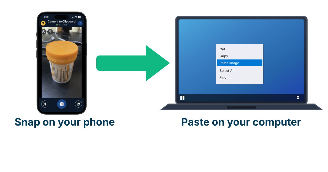
Use Camera to Clipboard to shoot a real photo of your product
Nobody on the Display Network went looking for you, which means the picture is doing every bit of the persuading that intent does on Search. A stock image half your competitors are also using cannot do that, and a photograph of the actual thing can. The reason people reach for stock anyway is that getting a phone photo into the tool they design in is annoying. Camera to Clipboard, one of my own apps, removes that step.
- A photo you take inside Camera to Clipboard is ready to paste on your computer the moment you take it. There is no emailing it to yourself, no cable and no upload to somebody else's website in between. The phone and the computer find each other over your own local network and send the picture directly.
- Pasting into Photoshop or GIMP drops the photo in as a new layer, which is where the ad gets built. Word and Google Docs take it inline instead. It arrives as an ordinary image sitting on the clipboard rather than as a file you have to go and find, so whatever you make ads in accepts it.
- A Display customer costs about $65.80 against $45.27 on Search, so the creative is the only lever left that is free to pull. You cannot make the intent appear and you cannot make the click cheaper than Google prices it. Shooting a better photograph costs nothing but the twenty minutes, and it is the one input in this whole channel you fully control.

432 experiments found almost nobody can measure their campaigns
The second half of the pitch is that Google knows so much about everyone that its targeting does the work for you. This one deserves a careful answer, because it is partly true and mostly overstated. Start with the best evidence that exists, which happens to be about the Google Display Network specifically.
- The largest clean study is a meta-analysis of 432 randomised field experiments run on the Google Display Network, covering 431 advertisers across many industries, averaging about four million users each over roughly twenty days. It used a technique called ghost ads, which identifies the exact people who would have seen your ad in the control group, so the comparison is genuinely like for like.
- Google Display lifts site visits about 16% and conversions about 8%. Median lift of about 16% in site visits and about 8% in conversions. Display genuinely causes incremental business. It is not a scam.
- But notice how far that is from the conversion column. An 8% median lift is nothing like the number of conversions a platform will happily attribute to a Display campaign, because most of those conversions were going to happen anyway.
Then the harder finding, which is why you personally probably cannot verify any of this in your own account:
- Advertising effects are tiny compared with the noise in sales data. A landmark set of 25 large field experiments across millions of customers found the median confidence interval on advertising ROI was more than 100 percentage points wide. The honest answer was frequently "somewhere between a disaster and a triumph".
- Proving a Display campaign worked can need ten million person-weeks of data. The same work concluded that an informative advertising experiment can require more than ten million person-weeks of data. If you are a small advertiser, you do not have that and never will.
- Observational measurement is worse than useless here. The authors' blunt conclusion was that selection bias, which is a direct consequence of targeting working at all, is crippling for the ordinary before-and-after methods most people use.
- Even on Search, attribution has been caught overstating. eBay's famous large-scale experiment found brand-keyword ads had no measurable short-term benefit at all, and that average returns for frequent shoppers were negative. Those ads had looked profitable for years in the reports.
And on the specific claim that Google's data pile is the secret ingredient, the research is unflattering:
- Behavioural targeting is worth surprisingly little at the impression level. A study of millions of real-time bidding transactions at a large publisher found that impressions carrying a cookie earned only about 4% more revenue than those without. If tracking multiplied effectiveness, that premium would not be a rounding error.
- Display targeting hits the right age and gender only about 63% of the time. Nielsen's own digital ad ratings work has put average on-target accuracy at roughly 63% even for simple age and gender targets, the categories with the best data coverage in the entire industry.
- The cookie question did not resolve the way everyone planned for. Google reversed its Chrome deprecation plan and third-party cookies are still there, and in October 2025 it retired most of the Privacy Sandbox proposals it had built as the replacement. The practical result is a messier signal environment, not a cleaner one.
So the fair summary is this: Google's data makes Display work better than random, and randomised experiments confirm a real lift. It does not make a low-intent impression behave like a high-intent search, and the effect it does produce is small enough that your own reporting cannot reliably see it.

Banner blindness is a real reflex and native formats answer it
Now to the thing you actually noticed. The reason modern display creative is quietly shedding its ad-ness is that being recognisable as an ad has a measurable cost, and the research on this is unusually old and unusually consistent.
- Banner blindness was documented in 1998. A Rice University study by Benway and Lane found users systematically missed banner-style elements even when those elements contained exactly the information they were hunting for. Not disliked. Did not see.
- Eye-tracking has confirmed it for nearly three decades. Nielsen Norman Group's repeated studies from the late 1990s to the 2020s find stable avoidance patterns: gaze skips the top banner zone, the right rail, and anything with a rectangular border, high-contrast colour and stock photography.
- Banner blindness is selective attention, not hostility toward advertisers. People allocate attention to things that serve their current goal. An ad-shaped rectangle has been reliably irrelevant for twenty-five years, so the brain files it as noise before you consciously read it.
- And a chunk of the audience removes them entirely. Around 30% of internet users worldwide run an ad blocker at least sometimes, and roughly a third in the United States. That share never enters the auction at all.
Native formats exist because they beat that reflex, and there is a landmark study with numbers on exactly how much:
- People look at native ads far more. The IPG Media Lab and Sharethrough study, which surveyed 4,770 people and eye-tracked 200, found consumers looked at native ads 53% more frequently than display ads, and 25% more people looked at in-feed native units than at display units.
- Attention on native approached attention on the actual editorial. That is the whole mechanism in one sentence: it is read like content because it is shaped like content.
- It moves brand metrics, not just eyeballs. Native registered 18% higher lift in purchase intent and 9% higher lift in brand affinity than banners, and 32% of people said a native ad was something they would share with a friend, against 19% for banners.
- Native inventory is also simply more visible. On 2026 viewability data, native clears around 81% against roughly 64% for desktop banner, measured against the standard of half the pixels on screen for at least one continuous second.
- The click gap is large in relative terms. Native units are commonly reported at four to ten times the click-through rate of standard banners, though note both numbers are tiny, so this is a big multiple of a small thing.
The line you must not cross, and it is a legal one. Looking native is fine. Concealing that it is an ad is not. The FTC's enforcement policy is explicit that a native ad is deceptive if it implies it is "independent, impartial, or from a source other than the sponsoring advertiser". Disclosure has to be clear, in plain words such as Ad, Advertisement or Sponsored, and placed before or above the headline where a reader meets it first.
The policy binds everyone in the chain, not just the brand: agencies and networks that help create or present the ad are covered too. The goal is an ad that reads as naturally as the page around it while being labelled unmistakably. That combination is legal and it is also what actually performs, because getting caught disguising an ad costs far more than the impression was worth.

Feed Google complete asset sets instead of designing banners
Here is the practical answer to "how do I make one of those ads that does not look like an ad", and it surprised me: you largely do not design it. Google assembles it. Your job is to give the assembler enough raw material that it can build a native unit instead of falling back to a plain rectangle.
- Responsive display ads are ingredients, not layouts. You upload headlines, descriptions, logos and images separately, and Google recombines them to fit whatever slot it wins, resizing and restyling per placement.
- Publisher native slots are part of that inventory. AdSense native units come in in-feed and in-article forms, built to match the host site's own look and sit inside the feed or between paragraphs. Those are the ads you have been noticing.
- Supply one image and one headline and Google can only build the generic banner. If you only supply one landscape image and one headline, the only thing Google can reliably build is the generic rectangle everyone's eyes skip. The native slots need the other shapes.
- So supply all three aspect ratios, every time. Horizontal at 1.91:1 (1200x628 recommended, 600x314 minimum), square at 1:1 (1200x1200, minimum 300x300), and vertical at 9:16 (900x1600, minimum 600x1067). Missing ratios are missing placements.
- Google asks for up to 15 images, 5 headlines and 5 descriptions per ad group. Google's own guidance is 5 to 10 images per aspect ratio, up to fifteen images total, up to five headlines of thirty characters, five descriptions and five logos, and 3 to 4 distinct ads per ad group carrying genuinely different messages rather than reworded twins.
- Add video if you have any. Supplying video alongside images in all recommended ratios expands which placements you are eligible for at all.
Then there is the format that is native by construction rather than by adaptation:
- Demand Gen puts you inside the feed itself, on YouTube and Shorts, the Discover feed, and Gmail's Social and Promotions tabs, rather than in a slot beside somebody's content.
- Feed placements reward phone-shot, plainly real creative over polished commercials. The consistent guidance for feed placements is user-generated-content style: shot on a phone, plainly real, matching what surrounds it. Studio gloss reads as an advert precisely because nothing else in the feed looks like that.
- The mindset is browsing, not buying. Discover users are scrolling, so creative that sparks curiosity outperforms creative that demands a purchase.
Design for the slot you want to win, not for the ad you want to make. A native placement is won by having the vertical crop, the short headline and the clean logo ready, not by art-directing a banner nobody was going to look at.
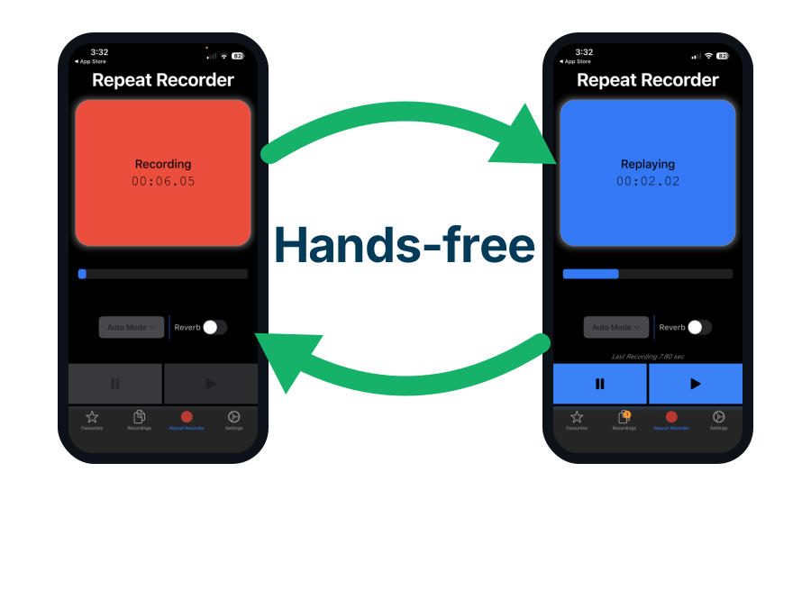
Use Repeat Recorder to rehearse the phone-shot video you upload
Supplying video alongside the images widens the placements you can win at all, and the guidance for feed placements is that it should look shot on a phone by a real person rather than made in a studio. That style has nowhere for a nervous delivery to hide, because the delivery is the entire production. Repeat Recorder, another of my own apps, records you and plays the take straight back without you touching the phone.
- Repeat Recorder replays each take automatically and then starts recording again, so you can run the same opening line twenty times without picking the phone up. That hands-free loop is the whole app. It was built for speech rehearsal, language learning and vocal training, and a fifteen second ad script is the same drill with money attached.
- Google asks for up to five headlines and five descriptions carrying genuinely different messages, so you need several scripts rather than one reworded five times. Saying each one out loud is the quickest way to find out that three of your five are the same sentence wearing different words, which is exactly what the guidance tells you not to submit.
- Takes worth keeping go into favourites and into folders you name yourself, which you can reorder by dragging. One folder per ad group keeps the five scripts for that group together, so you can play them back one after another and hear whether they actually differ.

Keep the brand loud, because ad size decides if you were seen
Once the asset plumbing is right, a short list of creative decisions does most of the remaining work. None of it is about being clever.
- Keep the brand unmistakable. This is the one place where "native" is dangerous, because native must never be allowed to mean unbranded. The evidence from adjacent research is consistent: brand-prominent creative beats subtle creative, and in Reddit's own analysis simply having a visible logo roughly doubled conversion.
- The vampire effect is an ad so striking that nobody remembers the advertiser. It describes an ad whose creative device is so striking that it drinks all the attention and leaves none for the advertiser. The joke, the celebrity, the gorgeous photograph does its job brilliantly, everyone remembers the ad, and nobody can tell you whose ad it was. The device fed on the brand it was supposed to be selling, which is where the name comes from.
- Native formats have their own version of it, and it is worse. A meme ad at least announces itself as an ad. A native unit is deliberately shaped like the page around it, so if the branding inside it is faint, the reader simply consumes it as another piece of content and walks away having absorbed nothing about you. Here the format itself becomes the vampire.
- Which gives you the rule for the whole section. Blend in with the layout, never with the identity. The styling should match the host page; the logo, product and name should be the one thing on it that unmistakably does not. I go through this failure mode in detail in Do Meme Ads Actually Work.
- Supply a clean logo at 1:1 or 4:1, with no flair or coloured background. Google asks for logos at 1:1 or 4:1, without flair, coloured backgrounds, or being overlaid on the image. A logo that reads at thumbnail size beats a beautiful one that does not.
- One idea per image, with the product as the subject. The guidance rules out blurry, heavily filtered, colour-inverted, skewed or digitally composited backgrounds, and text crowding the borders, because those all break when the image is recropped for another slot.
- Google calls out clickbait, all caps and generic messaging in its own guidance. Generic messaging, clickbait and all caps are called out explicitly in Google's guidance, along with punctuating the end of short headlines and repeating the same text in a headline and a description.
- Ad size is a viewability decision, not a design one. Viewability varies sharply by format: roughly 82% for 300x600, 71% for 300x250 and 56% for 728x90. Since crossing 70% viewability is associated with substantially higher brand lift, the tall units are doing real work that the leaderboard is not.
The two headline fields are not interchangeable
This is the part that catches people, because the field with the most room is the field that shows up least.
| Headline field | Room to explain yourself | How many you can supply | Placements it can fill |
|---|---|---|---|
| Short headline | Tightest 30 characters | Most up to 5 of them | Widest nearly every slot, including the smallest |
| Long headline | Roomiest 90 characters | Fewest only 1 | Narrower the roomier Display and Discover slots |
- So thirty characters is the real constraint, not ninety. The 30-character line is the only version of your message that every placement can display. If your point genuinely needs 90 characters to land, then in every small and narrow slot your ad runs with the point missing. You still pay for those impressions.
- The long headline has to stand on its own too. Google warns it may be shown with no description beside it, so it cannot be a setup line waiting for a punchline that never arrives.
- Headlines get clipped on narrow mobile placements, so front-load the words that matter. Headlines can still be clipped inside the official limit on narrow mobile placements, so anything load-bearing at the end of the line is the first thing to disappear.
- A clever headline breaks first when it gets cropped, because wordplay needs setup. Wordplay needs setup, and setup costs characters, so a clever line is usually the first thing to break when it gets cropped. A literal statement of what the product does keeps working at any length, and it still makes sense to somebody who has never heard of you, which on the Display Network is nearly everybody.
- The practical test: write the 30-character version first. "Snap on phone, paste on Mac" is 27 characters and survives everywhere. "Never email yourself a photo again" is 34, so it gets cut. If you cannot say the benefit in thirty characters, the problem is usually the proposition rather than the copywriting.

Retargeting reports a $38 customer that really costs $138
The same network, the same creative and the same budget produce wildly different reported economics depending on who is on the other end, which is why retargeting is the one thing almost every Display guide tells you to start with. This one does not, and the reason is at the end of the section. First the definition, because the word misleads almost everybody the first time they meet it.
Retargeting advertises to people who came to you and left
The natural assumption is that retargeting means re-serving an ad to someone who already saw that ad, which would indeed be pointless. That is not what it is.
- The audience is built from actions on your property, not from ad exposure. A retargeting list is people who visited your site, opened a particular page, viewed a product, started a signup, installed your app or abandoned a cart. Whether they ever saw an ad is irrelevant. Many arrived from search, a link or a friend.
- So the ad is not repeating the discovery, it is answering the drop-off. Discovery already happened, by definition, and it did not work. The visit is the proof of interest and the exit is the problem you are solving.
- Cold display traffic converts at about 1.5%, so 98 in 100 discoverers do nothing. Cold display traffic converts at roughly 1.5%, so about 98 out of every 100 people who discovered you did nothing about it. Landing page bounce rates typically run 60% to 90%. Treating discovery as mission accomplished writes off almost everybody who was interested enough to show up.
- Most of those people left for reasons that expire. Wrong moment, no time, not payday, comparing options, phone rang. None of those are "no", and none of them are fixed by finding a brand new stranger, which is what a prospecting campaign (the trade word for advertising to strangers) spends its money doing.
- Nobody has to have clicked an ad. You do not even have to be running ads yet. The tag fires when the page loads and has no idea how the visitor arrived. Traffic from organic search, a shared link, a bookmark or a forum post all lands on the list exactly the same as a paid click. This is the part most people get wrong, and it has a useful consequence: a site with decent organic traffic and no advertising at all is quietly accumulating an audience it could advertise to tomorrow.
The analytics tag you already have is the whole setup
This is where it gets easier than expected, because for most sites the tracking work is already done and the remaining job is a linking step in a settings screen.
- Linking an existing GA4 property beats installing a second remarketing tag. You can install a dedicated Google Ads remarketing tag on every page, or you can link an existing Google Analytics 4 property to your Google Ads account and use its audiences. If GA4 is already on the site, linking is the better route by a distance, because it means editing no pages at all.
- On a hand-built site, a second tag is one job per page plus a permanent tax. Anywhere every page's
<head>is a manual copy, adding a second tag is not one job, it is one job per page plus a permanent tax on every page you write afterwards. Linking an existing property avoids all of it. - The switch everybody misses: Enable Personalized Advertising. It appears while you link the property, and it must be on, along with Google signals in the Analytics settings. Leave it off and the audiences will look perfectly healthy in the interface while never filling up, which is a maddening thing to debug.
- Then build the audiences in Analytics, not in Google Ads. Once linked, they export automatically and become available for remarketing on Search, Display and YouTube. Allow up to two days for them to appear, so do not panic on day one.
- Define each audience by behaviour and recency. For example, visited the pricing page in the last 30 days but never reached the thank-you page. The exclusion is the important half: you are targeting people who did not finish.
- One site-wide retargeting audience mixes readers in with buyers. On a site that publishes articles as well as products, a single site-wide audience mixes people who came to read something with people who came to buy something, and the ad that follows is close to random. Build intent-shaped audiences: people who reached a specific product page and did not reach the checkout, signup or store link.
- Check you clear the minimum before planning around it. Google's threshold is 100 active users in the last 30 days, now standardised across Search, Display and YouTube, down from the old 1,000 on some networks. That is a big change in favour of small advertisers, but a narrow audience on a low-traffic site can still sit permanently below the line and never serve.
- Point a Display or Demand Gen campaign at that audience. Same network, same ad formats, completely different audience, and completely different numbers in the report. Whether those numbers are real is the next section.
- Do not assume a product feed is the better ad. Dynamic remarketing shows the exact item somebody looked at, and it is the most famous form of retargeting, but Lambrecht and Tucker's field experiment in the Journal of Marketing Research found it performed worse than a generic brand ad on average. It only won for people whose preferences had already narrowed, such as someone who had visited a review site since. Start generic, and test the feed rather than assuming it.
- Know what the website tag cannot see. It only knows about the website. Reaching people who installed a mobile app and then drifted away is a separate build, using the app's own analytics SDK linked to your ads account.
- Cap frequency and set a membership duration. Somebody who bounced 89 days ago is not the same prospect as somebody who bounced yesterday, and a list that never expires quietly becomes a cold list you are paying warm prices for.
The goal is the right moment, not wearing anyone down
- The honest answer to "does it need three or four views" is roughly yes, with a ceiling. Common display practice caps at three to five impressions per person per week, and general digital research puts the productive range at about two to seven exposures.
- Repeat exposure works by being there on the day somebody is ready, not by persuading. You cannot know which day somebody becomes ready to act, so a small number of exposures across the following weeks is a way of being there when the moment arrives. It is not an attempt to nag somebody into submission.
- Past three to five exposures a week, retargeting starts working against you. Wear-out is real and highly variable: in one body of research some campaigns decayed after one or two exposures while others showed little decay after fifty. Uncapped frequency is how retargeting earns its reputation for being creepy, and annoyance is a cost that does not show up in your reports.
- Which is why the exclusion list matters as much as the audience. Remove converters immediately. Continuing to advertise a product to somebody who already bought it is the single most common retargeting mistake, and every one of those impressions is pure waste.
Every dashboard number favours retargeting and all are measured
- Retargeting converts roughly two and a half times better. Median conversion of about 3.8% for retargeting against about 1.5% for advertising to strangers, and reported gaps of three to five times are common.
- The click-through gap is bigger still. Retargeting click-through around 0.7% against roughly 0.07% for standard display, which is the order of magnitude that separates "someone recognised you" from "someone did not".
- The clicks are not dearer, but they are not the bargain the benchmark posts claim either. Retargeting display clicks land near $0.76. Several benchmark sets put cold prospecting at $1.30 to $1.95 and sell that as a saving, but the Display Network average used earlier in this article is $0.63, so on that source a retargeting click costs slightly more, not less. What nobody disputes is the impression price, which runs 20% to 70% higher.
All of them measure the wrong thing, so $38 becomes $138
This is not a footnote to the section above. It reverses it, and it follows directly from the measurement problem set out earlier.
- Retargeting has the worst incrementality problem of any format, by construction. You are deliberately buying ads aimed at the people most likely to buy without them. The conversion rate is high for the same reason the credit is undeserved, so the two facts are not independent.
- A typical holdout finds the ads caused about 27.5% of the sales credited to them. Withhold the ads from a random slice of the audience and roughly three quarters of the "retargeting conversions" happen anyway. So every reported cost per customer has to be divided by about four before it can be compared to anything.
- Do that, and Google Display is the worst place on the internet to retarget. A reported $38 per customer becomes about $138. The same correction gives $95 on Google Search and $80 on Meta. Display charges the most for the least intent, exactly as it does everywhere else in this article.
- Compare that with this article's own cold numbers before you fund it. Cold Display reports about $66 per conversion and Search about $45, both before any incrementality correction of their own. A corrected $138 is not a discount on either of them. The cheap price on the retargeting line is the reporting, not the cost.
- Building the retargeting audience is free, whether or not you ever advertise to it. The tag costs nothing, the audience accumulates whether you advertise or not, and it powers conversion tracking regardless. Install it on day one. The decision this section is arguing about is whether to put budget behind it, which is a separate question with a different answer.
- If you spend anyway, spend it as a test with a holdout attached. Keep a random slice of the audience deliberately unexposed for a few weeks and compare. It is the only way to find your own number instead of inheriting the benchmark, and it is the difference between running an experiment and buying a story.
- Retargeting over-reports by design, because it targets people already set to convert. Every ad format over-reports to some degree. Retargeting is the one where the over-reporting is built into the targeting itself, so it never cancels out and never runs in your favour. Worse, it scales with success: the tighter you aim at people who were already going to buy, the better the dashboard looks and the less of it was ever yours. A campaign that reports twice the return of your cold campaigns is not twice as good, it is twice as selected.
- Some situations are worse than the average and some are better. Cart abandonment is the strongest case anywhere: a reported $13 per customer is about $47 corrected, which is the only version of this that lands near what a stranger costs. A free app that installs in one tap has almost no gap between interest and action to re-enter, and a site too small to reach 100 active users a month cannot build a list at all. The full breakdown, situation by situation, is in what retargeting actually costs once you correct for what it caused.

Switch off app placements and unseen impressions first
For a small advertiser, the largest single improvement is usually subtraction. The Display Network's default settings will happily spend your money in places no human would choose.
- Mobile app placements are the classic budget hole. Ads inside games, flashlight apps, photo-frame apps and children's apps generate plenty of clicks and almost no conversions. Excluding app categories, or excluding the mobile app category outright, is the first change most Display accounts should make.
- A large share of mobile ad clicks are mistakes. Survey work put roughly 60% of mobile banner clicks down to accidental taps, with people reporting they felt annoyed (68%), frustrated (45%) or angry (22%) afterwards. You paid for every one of those, and each bought you ill will.
- Made-for-advertising sites used to eat a fifth of all impressions. The ANA's programmatic transparency work found 15% of ad spend and 21% of impressions going to click-bait MFA sites in 2023, around $13 billion a year. The industry has cleaned this up dramatically, down to about 6.2% in 2024 and a fraction of a percent by late 2025, but only for advertisers who actively manage exclusions.
- Roughly a quarter to a third of impressions are never actually seen. Cross-network viewability sits near 72% in 2026, up from 67% in 2024, and desktop banner lags at 64%. You are paying for the rest.
- Cap frequency deliberately. Common display guidance is three to five impressions per person per week. Wear-out is highly variable in the research (some campaigns decay after one or two exposures, others show little decay after fifty), so treat the cap as a starting position you test, not a law.
- Optimised targeting is on by default and treats your audience as a hint, not a rule. It is on by default, and it treats your carefully chosen audience as a signal rather than an instruction. It can and will reduce or stop serving to your chosen segments if it finds cheaper conversions elsewhere. That is sometimes exactly what you want, and sometimes the reason your carefully built audience is not the audience being reached.

View-through conversions are a diagnosis, never a receipt
Display is the format where the reporting most flatters the buyer, and understanding one metric protects you from most of that.
- A view-through conversion credits an impression that was never clicked. Somebody was served your ad, ignored it completely, converted later for their own reasons, and the impression takes the credit.
- At Display's scale, false positives are guaranteed. Show ads to millions of people with a long lookback window and you will inevitably catch a large number of conversions that were going to happen regardless.
- Unseen impressions get counted too. Given viewability, a meaningful share of the impressions feeding your view-through numbers were never on anyone's screen for a full second.
- The workable rule: diagnose with view-through, decide with clicks and holdouts. Use view-through data to understand what is happening, and commit budget on click-based conversions and on incrementality tests where you deliberately withhold ads from a comparable group.
- Give Google a real conversion event, or its bidding will optimise for scrolling. If your only conversion event is a page view or a scroll, Google's bidding will faithfully optimise toward people who scroll. Feed it a real outcome, even if the volume is lower.
And be realistic about where the click lands. Display traffic converts on landing pages far worse than search or email traffic, which makes the cold-traffic page a different job entirely: one clear idea, one action, and no assumption that the visitor remembers who you are.
Use Camera to Clipboard to put a product photo on the landing page
A page built for cold Display traffic has to carry one clear idea, one action, and no assumption that the visitor remembers who you are. In practice that means the visitor has to see the product within a second of arriving, which means a real photograph rather than an illustration of a concept. Camera to Clipboard, one of my own apps, gets that photograph from the phone that took it onto the computer that builds the page.
- A photo you take inside Camera to Clipboard is on your computer's clipboard the moment you take it, with no email, no cable and no upload to a third party. The phone and the computer talk over your own local network. For a page you are still iterating on, that turns reshooting an image into a thirty second job rather than a task you postpone.
- You can send several photos at once out of the phone's library, which is what the three required aspect ratios actually demand. Google wants horizontal, square and vertical, five to ten images per ratio, and the page underneath usually reuses the same shots. Moving them in one batch is the difference between supplying the full set and supplying one landscape image.
- Display traffic converts on landing pages far worse than search or email traffic, so the page is where the money is lost rather than in the auction. Every number in this article says the same thing about where your effort belongs. The auction is Google's to price. The photograph at the top of the page is entirely yours.

Standalone Display is being retired into Demand Gen in 2026
Any guide written before this year is now partly out of date, so this matters more than it sounds. Google is not shutting down the Display Network. It is changing how you buy it.
- Google announced in May 2026 that standalone Display campaigns are being retired. Standalone Display campaigns are being absorbed into Demand Gen, with the Display Network becoming an inventory channel inside it rather than its own campaign type.
- June 2026: the migration tool started rolling out in phases, letting eligible advertisers move existing campaigns on their own schedule.
- Through the second half of 2026: new standalone Display campaigns stop being creatable. Existing ones remain editable until they are moved.
- 2027: whatever is left gets migrated automatically, on Google's timing rather than yours, which is the real argument for doing it yourself before a peak trading period.
- Migrating with the tool preserves up to 42 days of performance history, cutting the relearning period to roughly a day or two. Your old campaign moves to Removed status but stays visible for reporting, and the new one appears with "#2" appended to the name.
- The same two million sites and apps are still there. Channel controls let you run on the Display Network alone if that is what you want, but you now manage it beside YouTube, Discover, Gmail and Maps.
- Google's pitch for the change is a modest efficiency gain, citing an average 9.5% increase in ROI for advertisers adding Display Network inventory to Demand Gen campaigns. Treat a vendor's own uplift figure with the same suspicion as any other, but the direction of travel is not optional.
The strategic read is straightforward. Google is pushing display buying toward feed-native, multi-format, creative-led campaigns and away from standalone banner buying. Which is the same conclusion the attention research reached years ago, arriving now as a product decision.

Four ways to buy Google inventory, compared on what differs
Putting it together, here is how the realistic options stack up.
| How you are buying | Cost per click | Cost per customer | Buyer intent | Beats ad blindness | Creative work needed | Can you trust the numbers |
|---|---|---|---|---|---|---|
| Google Search | Dearest around $2.69 | Cheapest around $45 per conversion | Highest they asked for it | Mixed many scroll to organic | Lowest text only | Mixed brand terms overstated |
| Display, cold prospecting | Cheapest around $0.63 | Expensive around $66 per conversion | Lowest pure interruption | Worst the classic banner | Moderate full asset sets | Worst view-through inflation |
| Display, retargeting | Cheap around $0.76 | Dearest by far about $138 corrected, $38 reported | Warm already visited you | Better they recognise you | Moderate same asset sets | Worst they would have bought anyway |
| Demand Gen, native feeds | Middling feed inventory | Middling depends on creative | Low browsing not buying | Best native clears 81% viewable | Highest video plus every ratio | Mixed needs holdouts |
No row wins outright, which is the point. Cold Display buys the cheapest attention and the dearest customers. Search buys the dearest attention and the cheapest customers. Retargeting wins every column the dashboard fills in but loses the only one that pays your bills, because the correction that turns $38 into $138 is invisible inside the ads interface. Native feeds win the attention battle and demand the most creative effort to enter.

Create the demand cheaply on Display, then let Search close it
Here is the whole thing as a working method rather than a list of facts.
- Display buys cheap reach from people who were never going to search for you. Display is for being seen cheaply by people who were never going to search for you yet. If you need someone to buy today, that budget belongs on Search.
- Judge Display on reach and incremental lift, never on last-click return. Reach, recall, assisted demand, incremental lift. Judging a demand-creation channel on last-click return is how everybody talks themselves out of a channel that was working.
- Tag from day one, but do not start by funding retargeting. Building the list is free and useful whatever you decide. Spending on it is the dearest customer in the table once you divide the reported figure by the roughly 27.5% of sales a holdout credits to the ads, and Google Display is the most expensive of the three places to run it. If you do fund it, fund it as a test with a holdout attached.
- Feed the machine properly. All three aspect ratios, five to ten images each, five headlines, five descriptions, clean logos, video if you have it, three or four genuinely different ads per group. Incomplete assets mean the generic banner nobody looks at.
- Aim at native placements deliberately. They are looked at 53% more, they clear far higher viewability, and Demand Gen is where Google is putting them. Match the feed with plain, real creative rather than gloss.
- Keep the brand loud inside the native look. Blending in is a distribution strategy. Being unidentifiable is a way to buy attention for nobody.
- Exclude app categories and cap frequency before touching the creative. Exclude app categories, cap frequency at three to five a week, watch placement reports, and treat anything with an implausible click-through rate as accidental taps rather than a discovery.
- Then put a capture channel underneath. Display and native feeds write the demand. Google Search cashes the cheque when that demand turns into somebody typing your category into a search box.
Display advertising is cheap the way raw materials are cheap. It rewards the advertiser who understands they are buying attention and building demand, and it quietly punishes the one who thought they were buying customers at a discount.
Conclusion: how to make a Google Display ad work, in one glance
- A Google Display click is genuinely cheap and a Google Display customer is not. A Display click costs about a quarter of what the same click costs on Google Search, converts about five times worse, and ends up costing more per conversion. Display buys attention from people who were not looking for you, not customers at a discount.
- A retargeting customer the Google Ads dashboard reports at $38 really costs about $138. Holdout tests credit retargeting with only about 27.5% of the sales it claims, because most of those people were coming back anyway. The corrected figure is worse than Google Search at $95 and Meta at $80, so the placement that looks best on the dashboard is the most expensive one on the network.
- Exclude app placements and cap frequency before spending anything on better Display creative. Ads inside games and flashlight apps, accidental taps on mobile banners and impressions nobody ever saw waste more money than any creative change recovers. Cap the ad at three to five views per person per week, read the placement report, and treat an implausibly high click rate as mistaken taps rather than a success.